PropertyFieldButton control
This control generates a Button Control .
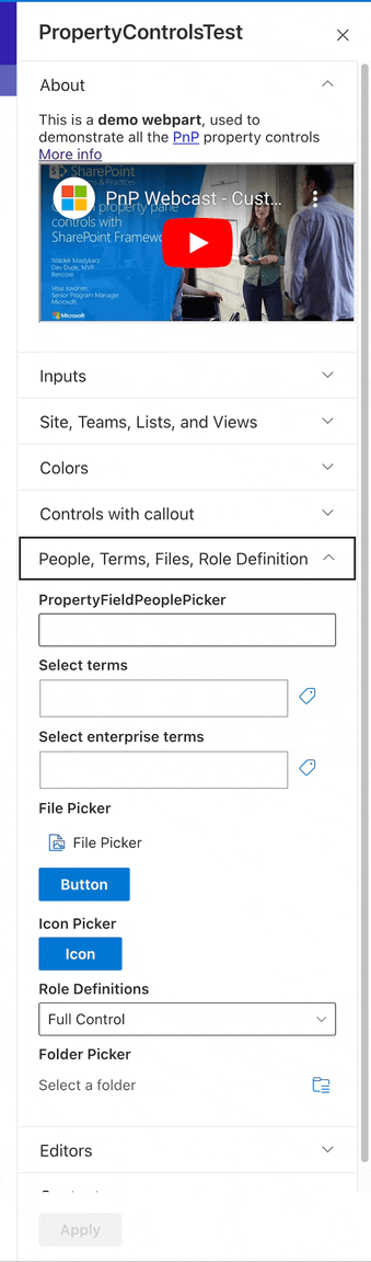
PropertyFieldButton example usage
How to use this control in your solutions
- Check that you installed the
@pnp/spfx-property-controlsdependency. Check out The getting started page for more information about installing the dependency. - Import the following modules to your component:
import { PropertyFieldButton} from '@pnp/spfx-property-controls/lib/PropertyFieldButton';
- Add the custom property control to the
groupFieldsof the web part property pane configuration:
 PropertyFieldButton("", {
      text={"Button"}
      key={"buttonID"}
      disabled={false}
      className={className}
      styles={styles}
      onClick={()=>{alert("Button Clicked")}}
      iconProps={iconProps}
      isPrimary={true}
      isVIsible={true}

  })
Implementation
The PropertyFieldButton control can be configured with the following properties:
| Property | Type | Required | Description |
|---|---|---|---|
| key | string | yes | An unique key that indicates the identity of this control. |
| styles | IButtonStyles | no | styles object |
| classname | string | no | css ClassName |
| isVisible | boolean | yes | Indicate if button is visible |
| text | string | no | text of button |
| isPrimary | boolean | yes | indicate Button is a primary button |
| iconProps | IIconProps | no | text of button |
| disable | boolean | no | Disable control |
| onClick | (e:any) =>void | yes | Onclick function |