PropertyFieldTextWithCallout control
This control generates a text field control with a callout.
PropertyFieldTextWithCallout rendering

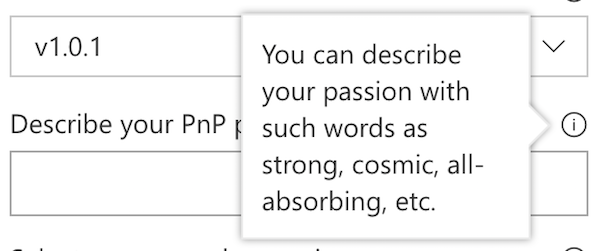
PropertyFieldTextWithCallout callout opened

How to use this control in your solutions
- Check that you installed the
@pnp/spfx-property-controlsdependency. Check out The getting started page for more information about installing the dependency. - Import the following modules to your component:
import { CalloutTriggers } from '@pnp/spfx-property-controls/lib/PropertyFieldHeader';
import { PropertyFieldTextWithCallout } from '@pnp/spfx-property-controls/lib/PropertyFieldTextWithCallout';
- Create a new property for your web part, for example:
export interface IPropertyControlsTestWebPartProps {
  textInfoHeaderValue: string;
}
- Add the custom property control to the
groupFieldsof the web part property pane configuration:
PropertyFieldTextWithCallout('textInfoHeaderValue', {
  calloutTrigger: CalloutTriggers.Hover,
  key: 'textInfoHeaderFieldId',
  label: 'Describe your PnP passion with few words',
  calloutContent: React.createElement('span', {}, 'You can describe your passion with such words as strong, cosmic, all-absorbing, etc.'),
  calloutWidth: 150,
  value: this.properties.textInfoHeaderValue
})
Implementation
The PropertyFieldTextWithCallout control uses the same implementation as the default PropertyPaneTextField and has the following additional properties:
| Property | Type | Required | Description |
|---|---|---|---|
| calloutContent | React.ReactNode | no | Callout content - any HTML |
| calloutWidth | number | no | Custom width for callout including borders. If value is 0, no width is applied. |
| calloutTrigger | CalloutTriggers | no | Event to show the callout |
| gapSpace | number | no | The gap between the callout and the target |
Enum CalloutTriggers
| Name | Description |
|---|---|
| Click | Shows the callout when you hover over the icon |
| Hover | Shows the callout when you click on the icon |