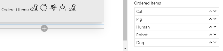
PropertyFieldOrder control
This control generates a list that can be easily reordered using drag and drop and/or arrow buttons.
PropertyFieldOrder
How to use this control in your solutions
- Check that you installed the
@pnp/spfx-property-controlsdependency. Check out The getting started page for more information about installing the dependency. - Import the following modules to your component:
import { PropertyFieldOrder } from '@pnp/spfx-property-controls/lib/PropertyFieldOrder';
- Create a new property for your web part, for example:
export interface IPropertyControlsTestWebPartProps {
  orderedItems: Array<any>;
}
- Add the custom property control to the
groupFieldsof the web part property pane configuration:
PropertyFieldOrder("orderedItems", {
  key: "orderedItems",
  label: "Ordered Items",
  items: this.properties.orderedItems,
  properties: this.properties,
  onPropertyChange: this.onPropertyPaneFieldChanged
})
Item Rendering
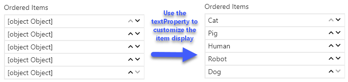
By default, items will render using the toString() method for each element in your items array. This works well for simple arrays of strings, numbers, etc.
Object Property
When working with an array of objects, you can specify the name of the property to use as the display value by specifying the textProperty property.
For instance, for an array of objects like the following:
[
  {"text": "Cat", "iconName": "Cat"},
  {"text": "Pig", "iconName": "Savings"},
  {"text": "Human", "iconName": "Running"},
  {"text": "Robot", "iconName": "Robot"},
  {"text": "Dog", "iconName": "FangBody"}
]
To prevent every item from showing as [object Object], you can set the textProperty property to the name of the property you would like to use for display:
PropertyFieldOrder("orderedItems", {
  key: "orderedItems",
  label: "Ordered Items",
  items: this.properties.orderedItems,
  textProperty: "text",
  properties: this.properties,
  onPropertyChange: this.onPropertyPaneFieldChanged
})
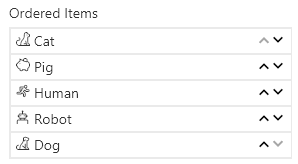
Custom Rendering
You can fully customize how items are rendered by providing the onRenderItem callback function and returning whatever JSX.Element you want.
For example, you can define your function in a tsx file like this:
import * as React from 'react';

export const orderedItem = (item:any, index:number): JSX.Element => {
    return (
        <span>
            <i className={"ms-Icon ms-Icon--" + item.iconName} style={{paddingRight:'4px'}}/>
            {item.text}
        </span>
    );
};
You can then import this function into your webpart using the relative path to this file similar to the following:
import { orderedItem } from './components/OrderedItem';
Then you can simply reference it in your PropertyFieldOrder:
PropertyFieldOrder("orderedItems", {
  key: "orderedItems",
  label: "Ordered Items",
  items: this.properties.orderedItems,
  onRenderItem: orderedItem,
  properties: this.properties,
  onPropertyChange: this.onPropertyPaneFieldChanged
})
Implementation
The PropertyFieldOrder control can be configured with the following properties:
| Property | Type | Required | Description |
|---|---|---|---|
| label | string | yes | Property field label displayed on top. |
| items | Array |
yes | An array of values to reorder. |
| textProperty | string | no | The property to use for display, when undefined, the toString() method of the object is used (ignored when the onRenderItem function is specified) |
| maxHeight | number | no | The maximum height for the items in px (when not set, the control expands as necessary) |
| disabled | boolean | no | Specify if the control needs to be disabled. |
| disableDragAndDrop | boolean | no | When true, drag and drop reordering is disabled (defaults to false) |
| removeArrows | boolean | no | When true, arrow buttons are not displayed (defaults to false) |
| moveUpIconName | string | no | The name of the UI Fabric Font Icon to use for the move up button (defaults to ChevronUpSmall) |
| moveDownIconName | string | no | The name of the UI Fabric Font Icon to use for the move down button (defaults to ChevronDownSmall) |
| onRenderItem | function | no | Optional callback to provide custom rendering of the item (default is simple text based on either item or the property identified in the textProperty) |
| properties | any | yes | Parent web part properties, this object is use to update the property value. |
| onPropertyChange | function | yes | Defines a onPropertyChange function to raise when the date gets changed. |
| key | string | yes | An unique key that indicates the identity of this control. |