PropertyFieldGrid control
This control generates a Grid Control .
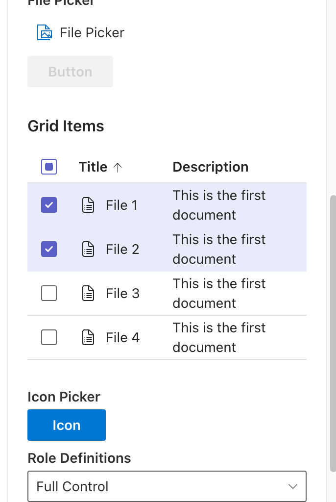
PropertyFieldGrid example usage
How to use this control in your solutions
- Check that you installed the
@pnp/spfx-property-controlsdependency. Check out The getting started page for more information about installing the dependency. - Import the following modules to your component:
import { PropertyFieldGrid, IItem} from '@pnp/spfx-property-controls/lib/PropertyFieldGrid';
- define the items to show in the grid:

const gridItems:IItem[] = [
  {
    key: "1",
    icon: React.createElement(DocumentBulletListRegular) ,
    title: "File 1",
    description: "This is the first document"
  },
  {
    key: "2",
    icon: React.createElement(DocumentBulletListRegular) ,
    title: "File 2",
    description: "This is the 2 document"
  },
  {
    key: "3",
    icon: React.createElement(DocumentBulletListRegular) ,
    title: "File 3",
    description: "This is the 3 document"
  },
  {
    key: "4",
    icon: React.createElement(DocumentBulletListRegular) ,
    title: "File 4",
    description: "This is the 4 document"
  }
 ];

- Add the custom property Grid to the `groupFields` of the web part property pane configuration:

 PropertyFieldGrid('gridItems', {
          multiSelect: true,
          items: gridItems,
          label: 'Grid Items',
          key: 'gridFieldId',
          defaultSelectedItems: this.properties.gridItems,
          maxHeight: 500,
          className: 'gridClass',
          styles:  {padding: 10},
          isVisible: true,
          maxHeight: 500,
          column1Label: 'File',
          column2Label: 'Location',
          onSelected: (item: IItem[]) => {
            console.log(item);
          }
          )
Implementation
The PropertyFieldGrid control can be configured with the following properties:
| Property | Type | Required | Description |
|---|---|---|---|
| key | string | yes | An unique key that indicates the identity of this control. |
| styles | IButtonStyles | no | styles object (root container) |
| classname | string | no | css ClassName (root container) |
| isVisible | boolean | no | Indicate if grid is visible |
| label | string | no | label of Grid |
| defaultSelectedItems | (items:IItem[]) =>void | no | defined default Item selected |
| maxHeigth | number | no | max height of the container , default 400px |
| onSelected | item[] | no | selected Items when are selected |
| items | IItem[] | yes | Items to show |
| multiSelect | boolean | no | Enable multiSelect , default single |
| column1Label | string | no | Label for header of first grid column |
| column2Label | string | no | Label for header of second grid column |