PropertyFieldLabelWithCallout control
This control generates a label control with a callout.
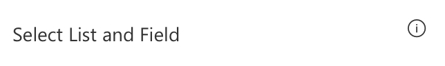
PropertyFieldLabelWithCallout rendering
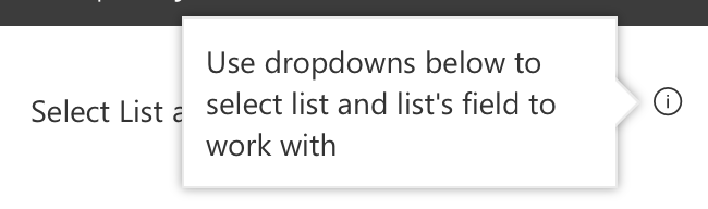
PropertyFieldLabelWithCallout callout opened
How to use this control in your solutions
- Check that you installed the
@pnp/spfx-property-controlsdependency. Check out The getting started page for more information about installing the dependency. - Import the following modules to your component:
import { CalloutTriggers } from '@pnp/spfx-property-controls/lib/Callout';
import { PropertyFieldLabelWithCallout } from '@pnp/spfx-property-controls/lib/PropertyFieldLabelWithCallout';
- Add the custom property control to the
groupFieldsof the web part property pane configuration:
PropertyFieldLabelWithCallout('fakeProp', {
  calloutTrigger: CalloutTriggers.Click,
  key: 'LabelWithCalloutFieldId',
  calloutContent: 'Use dropdowns below to select list and list\'s field to work with',
  calloutWidth: 200,
  text: 'Select List and Field'
})
Implementation
The PropertyFieldLabelWithCallout control uses the same implementation as the default PropertyPaneLabel and has the following additional properties:
| Property | Type | Required | Description |
|---|---|---|---|
| calloutContent | React.ReactNode | no | Callout content - any HTML |
| calloutWidth | number | no | Custom width for callout including borders. If value is 0, no width is applied. |
| calloutTrigger | CalloutTriggers | no | Event to show the callout |
| gapSpace | number | no | The gap between the callout and the target |
Enum CalloutTriggers
| Name | Description |
|---|---|
| Click | Shows the callout when you hover over the icon |
| Hover | Shows the callout when you click on the icon |