PropertyFieldNumber control
This control generates an input field for numbers. Text is not allowed as this will result into an invalid input.
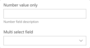
PropertyFieldNumber example usage
How to use this control in your solutions
- Check that you installed the
@pnp/spfx-property-controlsdependency. Check out The getting started page for more information about installing the dependency. - Import the following modules to your component:
import { PropertyFieldNumber } from '@pnp/spfx-property-controls/lib/PropertyFieldNumber';
- Create a new property for your web part, for example:
export interface IPropertyControlsTestWebPartProps {
  numberValue: number;
}
- Add the custom property control to the
groupFieldsof the web part property pane configuration:
PropertyFieldNumber("numberValue", {
  key: "numberValue",
  label: "Number value only",
  description: "Number field description",
  value: this.properties.numberValue,
  maxValue: 10,
  minValue: 1,
  disabled: false
})
- You can also implement your own validation with the
onGetErrorMessageproperty as follows:
PropertyFieldNumber("numberValue", {
  key: "numberValue",
  label: "Number value only",
  description: "Number field description",
  value: this.properties.numberValue,
  maxValue: 10,
  minValue: 1,
  disabled: false,
  onGetErrorMessage: (value: number) => {
    if (value % 2 !== 0) {
      return 'Only even numbers are allowed';
    }
    return '';
  }
})
Implementation
The PropertyFieldNumber control can be configured with the following properties:
| Property | Type | Required | Description |
|---|---|---|---|
| key | string | yes | An unique key that indicates the identity of this control. |
| label | string | yes | Property field label displayed on top. |
| description | string | no | The number field input description. |
| placeholder | string | no | Placeholder text to be displayed in the number field. |
| value | number | no | Value to be displayed in the number field. |
| maxValue | number | no | Maximum number that can be inserted. |
| minValue | number | no | Minimum number that can be inserted. |
| ariaLabel | string | no | The aria label for the number field. |
| disabled | boolean | no | Specify if the control needs to be disabled. |
| errorMessage | string | no | If set, this will be displayed as an error message. |
| onGetErrorMessage | (value: number) => string | no | If set, this method is used to get the validation error message and determine whether the input value is valid or not. |
| deferredValidationTime | number | no | Number field will start to validate after users stop typing for deferredValidationTime milliseconds. |
| precision | number | no | Precision to round the value to. If the precision is not defined the value is not rounded. |