PropertyFieldSpinner control
This control generates a Message Bar that will show messages .
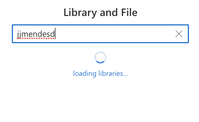
PropertyFieldSpinner example usage
How to use this control in your solutions
- Check that you installed the
@pnp/spfx-property-controlsdependency. Check out The getting started page for more information about installing the dependency. - Import the following modules to your component:
import { PropertyFieldSpinner} from '@pnp/spfx-property-controls/lib/PropertyFieldSpinner';
- Add the custom property control to the
groupFieldsof the web part property pane configuration:
 PropertyFieldSpinner("", {
      key: "sp1",
      size: SpinnerSize.medium,
      isVisible: true,
      label: "Loading ..."
  })
Implementation
The PropertyFieldSpinner control can be configured with the following properties:
| Property | Type | Required | Description |
|---|---|---|---|
| key | string | yes | An unique key that indicates the identity of this control. |
| size | SpinnerSize | yes | Size of Spinner |
| classname | string | no | css ClassName |
| isVisible | boolean | yes | Indicate if message is visible |
| Label | string | no | Label to Show |