Accordion
This control allows you to render an accordion control.
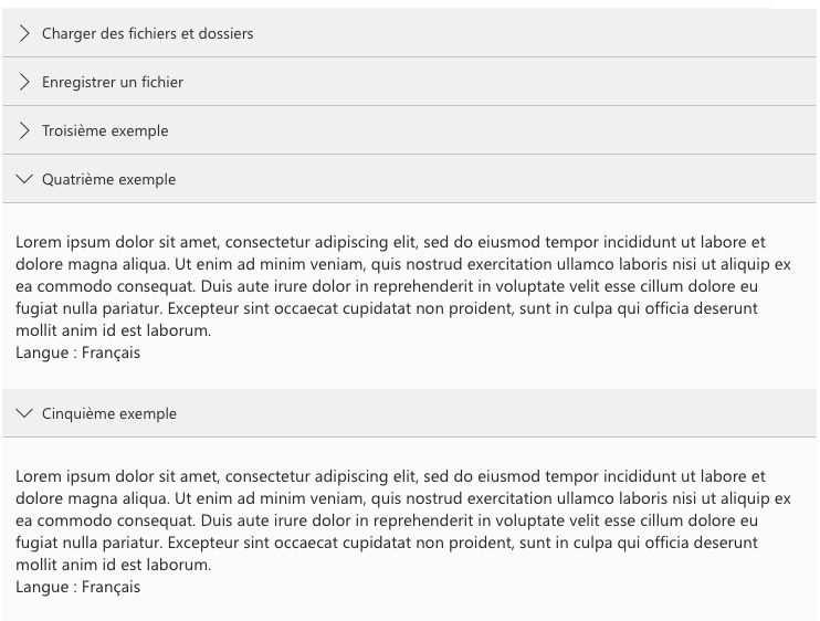
Here is an example of the control in action:
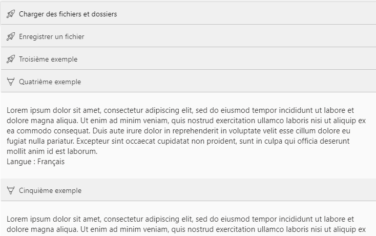
Here is an example of the control with custom icons:
How to use this control in your solutions
- Check that you installed the
@pnp/spfx-controls-reactdependency. Check out the getting started page for more information about installing the dependency. - In your component file, import the
Accordioncontrol as follows:
import { Accordion } from "@pnp/spfx-controls-react/lib/Accordion";
- Use the
Accordioncontrol in your code as follows:
{
  sampleItems.map((item, index) => (
    <Accordion title={item.Question} defaultCollapsed={true} className={"itemCell"} key={index}>
      <div className={"itemContent"}>
        <div className={"itemResponse"}>{item.Reponse}</div>
        <div className={"itemIndex"}>{`Langue :  ${item.Langue.Nom}`}</div>
      </div>
    </Accordion>
  ))
}
- For the
Accordioncontrol with custom icons:
{
  <Accordion title={item.Question} defaultCollapsed={true} className={"itemCell"} key={index} collapsedIcon={"Rocket"} expandedIcon={"InkingTool"}>
}
Implementation
The Accordion control can be configured with the following properties:
| Property | Type | Required | Description | Default |
|---|---|---|---|---|
| title | string | yes | The title in the accordion to display. | |
| defaultCollapsed | boolean | no | Is the accordion by default collapsed? | false |
| className | string | no | Additional class name to add to your accordion. | |
| collapsedIcon | string | no | Optional custom icon when accordion is collapsed See Fluent UI icons | ChevronRight |
| expandedIcon | string | no | Optional custom icon when accordion is expanded See Fluent UI icons | ChevronDown |