Placeholder control
This control renders a placeholder which can be used to show a message that the web part still has to be configured.
How to use this control in your solutions
- Check that you installed the
@pnp/spfx-controls-reactdependency. Check out the getting started page for more information about installing the dependency. - Import the following modules to your component:
import { Placeholder } from "@pnp/spfx-controls-react/lib/Placeholder";
- Use the
Placeholdercontrol in your code as follows:
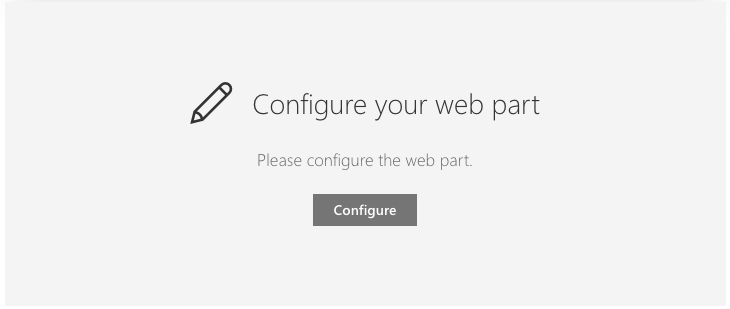
<Placeholder iconName='Edit'
             iconText='Configure your web part'
             description='Please configure the web part.'
             buttonLabel='Configure'
             onConfigure={this._onConfigure}
             theme={this.props.themeVariant} />
- With custom element for
description:
<Placeholder iconName='Edit'
             iconText='Configure your web part'
             description={defaultClassNames => <span className={`${defaultClassNames} ${additionalStyles}`}>Please configure the web part.</span>}
             buttonLabel='Configure'
             onConfigure={this._onConfigure}
             theme={this.props.themeVariant} />
- With the
onConfigureproperty you can define what it needs to do when you click on the button. Like for example opening the property pane:
private _onConfigure = () => {
  // Context of the web part
  this.props.context.propertyPane.open();
}
Sample of using the hideButton functionality for hiding the button when page is in read mode:
<Placeholder iconName='Edit'
             iconText='Configure your web part'
             description='Please configure the web part.'
             buttonLabel='Configure'
             hideButton={this.props.displayMode === DisplayMode.Read}
             onConfigure={this._onConfigure}
             theme={this.props.themeVariant} />
Sample to only display Placeholder when the web part is in edit mode:
{
  this.displayMode === DisplayMode.Edit ?
  <Placeholder iconName='Edit'
               iconText='Configure your web part'
               description='Please configure the web part.'
               buttonLabel='Configure'
               onConfigure={this._onConfigure}
               theme={this.props.themeVariant} /> :
  <div />
}
Implementation
The placeholder control can be configured with the following properties:
| Property | Type | Required | Description |
|---|---|---|---|
| buttonLabel | string | no | Text label to be displayed on the button bellow the description. The button is optional. |
| contentClassName | string | no | This is the className that is applied to the root element of the content zone. You can use this to apply custom styles to the placeholder. |
| description | string | ((defaultClassNames: string) => React.ReactElement) | yes | Text description or render function for the placeholder. This appears bellow the Icon and IconText. |
| iconName | string | yes | The name of the icon that will be used in the placeholder. This is the same name as you can find on the Office UI Fabric icons page: Office UI Fabric icons. For example: Page or Add. |
| iconText | string | ((defaultClassNames: string) => React.ReactElement) | yes | Heading text or render function which is displayed next to the icon. |
| hideButton | boolean | no | Specify if you want to hide the button. Default is false. |
| onConfigure | function | no | onConfigure handler for the button. The button is optional. |
| theme | IPartialTheme | ITheme | no | Set Fluent UI Theme. If not set or set to null or not defined, the theme passed through context will be used, or the default theme of the page will be loaded. |