ViewPicker control
This control allows you to select available views from lists/libraries of the current site.
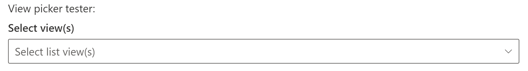
Here is an example of the control:
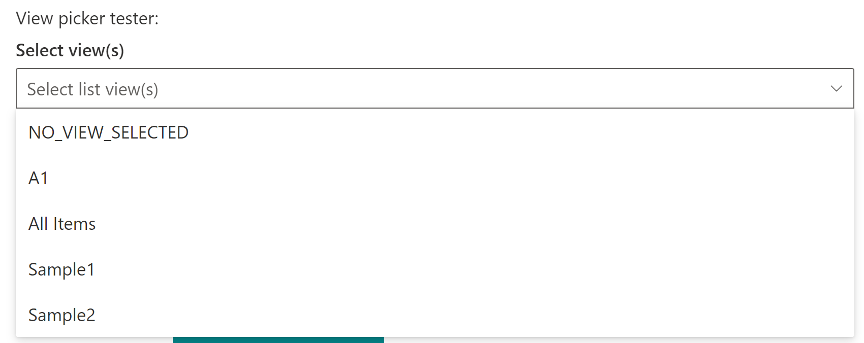
ViewPicker single selection mode:
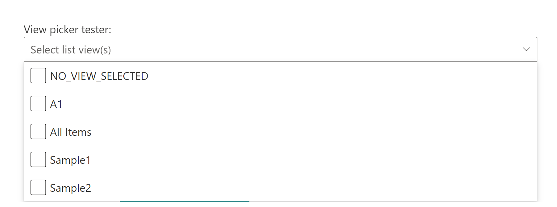
ViewPicker multi selection mode:
How to use this control in your solutions
- Check that you installed the
@pnp/spfx-controls-reactdependency. Check out the getting started page for more information about installing the dependency. - Import the control into your component:
import { ViewPicker } from "@pnp/spfx-controls-react/lib/ViewPicker";
- Use the
ViewPickercontrol in your code as follows:
    <ViewPicker context={this.props.context}
        listId={"9f3908cd-1e88-4ab3-ac42-08efbbd64ec9"}
        placeholder={'Select list view(s)'}
        orderBy={orderBy.Title}
        multiSelect={true}
        onSelectionChanged={this.onViewPickerChange} />
- The
onSelectionChangedchange event returns the selected view(s) and can be implemented as follows in your webpart:
  private onViewPickerChange = (views: string | string[]) => {
    console.log("Views:", views);
  }
Implementation
The ViewPicker control can be configured with the following properties
| Property | Type | Required | Description |
|---|---|---|---|
| context | BaseComponentContext | yes | The context object of the SPFx loaded webpart or customizer. |
| className | string | no | If provided, additional class name to provide on the dropdown element. |
| disabled | boolean | no | Whether or not the view picker control is disabled. |
| filter | string | no | Filter views from OData query. |
| label | string | no | Label to use for the control. |
| listId | string | no | The List Id of the list. |
| placeholder | string | no | Placeholder label to show in the dropdown. |
| orderBy | Enum | no | How to order the set of views (By ID or Title). |
| selectedView | string OR string[] | no | Keys(View Ids) of the selected item(s). If you provide this, you must maintain selection state by observing onSelectionChanged events and passing a new value in when changed. |
| multiSelect | boolean | no | Optional mode indicates if multi-choice selections is allowed. Default to false. |
| showBlankOption | boolean | no | Whether or not to show a blank option. Default to false. |
| viewsToExclude | string[] | no | Defines view titles which should be excluded from the view picker control. |
| webAbsoluteUrl | string | no | Absolute Web Url of target site (user requires permissions) |
| onSelectionChanged | (newValue: string OR string[]): void | no | Callback function when the selected option changes. |
Enum orderBy
| Value |
|---|
| Id |
| Title |