Grid Layout control
This control renders a responsive grid layout for your web parts. The grid layout behaves according to the SharePoint web part layouts design pattern.
The grid layout will automatically reflow grid items according to the space available for the control. On mobile devices and 1/3 column layouts, it will render a compact layout.
Although it is best used with the Fabric UI DocumentCard control, it will render any rectangular content you wish to display.
How to use this control in your solutions
- Check that you installed the
@pnp/spfx-controls-reactdependency. Check out the getting started page for more information about installing the dependency. - Import the following modules to your component:
import { GridLayout } from "@pnp/spfx-controls-react/lib/GridLayout";
- Retrieve the items you wish to display in your grid control. For example, you can place them in your component's
state:
// This sample places loads items in the constructor. You may wish to load
// your items in the componentDidUpdate
constructor(props: IMyWebPartProps) {
super(props);
this.state = {
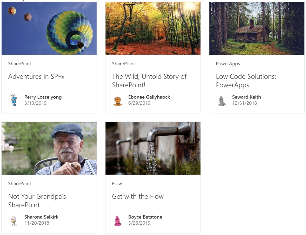
items: [{
thumbnail: "https://pixabay.com/get/57e9dd474952a414f1dc8460825668204022dfe05555754d742e7bd6/hot-air-balloons-1984308_640.jpg",
title: "Adventures in SPFx",
name: "Perry Losselyong",
profileImageSrc: "https://robohash.org/blanditiisadlabore.png?size=50x50&set=set1",
location: "SharePoint",
activity: "3/13/2019"
}, {
thumbnail: "https://pixabay.com/get/55e8d5474a52ad14f1dc8460825668204022dfe05555754d742d79d0/autumn-3804001_640.jpg",
title: "The Wild, Untold Story of SharePoint!",
name: "Ebonee Gallyhaock",
profileImageSrc: "https://robohash.org/delectusetcorporis.bmp?size=50x50&set=set1",
location: "SharePoint",
activity: "6/29/2019"
}, {
thumbnail: "https://pixabay.com/get/57e8dd454c50ac14f1dc8460825668204022dfe05555754d742c72d7/log-cabin-1886620_640.jpg",
title: "Low Code Solutions: PowerApps",
name: "Seward Keith",
profileImageSrc: "https://robohash.org/asperioresautquasi.jpg?size=50x50&set=set1",
location: "PowerApps",
activity: "12/31/2018"
}, {
thumbnail: "https://pixabay.com/get/55e3d445495aa514f1dc8460825668204022dfe05555754d742b7dd5/portrait-3316389_640.jpg",
title: "Not Your Grandpa's SharePoint",
name: "Sharona Selkirk",
profileImageSrc: "https://robohash.org/velnammolestiae.png?size=50x50&set=set1",
location: "SharePoint",
activity: "11/20/2018"
}, {
thumbnail: "https://pixabay.com/get/57e6dd474352ae14f1dc8460825668204022dfe05555754d742a7ed1/faucet-1684902_640.jpg",
title: "Get with the Flow",
name: "Boyce Batstone",
profileImageSrc: "https://robohash.org/nulladistinctiomollitia.jpg?size=50x50&set=set1",
location: "Flow",
activity: "5/26/2019"
}]
};
}
- Because you will implement the method to render each item in your web part, your items can be anything you'd like. Our sample data defines a
thumbnail,title,name,profileImageSrc,locationandactivityto coincide with the Fabric UIDocumentCardelements, but you can use any properties you need. - In the component that will call the
GridLayoutcontrol, create callback function to render every item in the grid. You can return any rectangular element you want. For example, this code uses the Fabric UIDocumentCardcontrol.
import {
  DocumentCard,
  DocumentCardActivity,
  DocumentCardPreview,
  DocumentCardDetails,
  DocumentCardTitle,
  IDocumentCardPreviewProps,
  DocumentCardLocation,
  DocumentCardType
} from 'office-ui-fabric-react/lib/DocumentCard';
import { ImageFit } from 'office-ui-fabric-react/lib/Image';
import { ISize } from 'office-ui-fabric-react/lib/Utilities';

...

 private _onRenderGridItem = (item: any, finalSize: ISize, isCompact: boolean): JSX.Element => {
    const previewProps: IDocumentCardPreviewProps = {
      previewImages: [
        {
          previewImageSrc: item.thumbnail,
          imageFit: ImageFit.cover,
          height: 130
        }
      ]
    };

    return <div
      data-is-focusable={true}
      role="listitem"
      aria-label={item.title}
    >
      <DocumentCard
        type={isCompact ? DocumentCardType.compact : DocumentCardType.normal}
        onClick={(ev: React.SyntheticEvent<HTMLElement>) => alert("You clicked on a grid item")}

      >
        <DocumentCardPreview {...previewProps} />
        {!isCompact && <DocumentCardLocation location={item.location} />}
        <DocumentCardDetails>
          <DocumentCardTitle
            title={item.title}
            shouldTruncate={true}
          />
          <DocumentCardActivity
            activity={item.activity}
            people={[{ name: item.name, profileImageSrc: item.profileImageSrc }]}
          />
        </DocumentCardDetails>
      </DocumentCard>
    </div>;
  }
Note that the sample code above uses the
isCompactparameter to removeDocumentCardelements and to render a compact layout. You may choose to ignore theisCompactparameter if you do not wish to handle compact layouts.
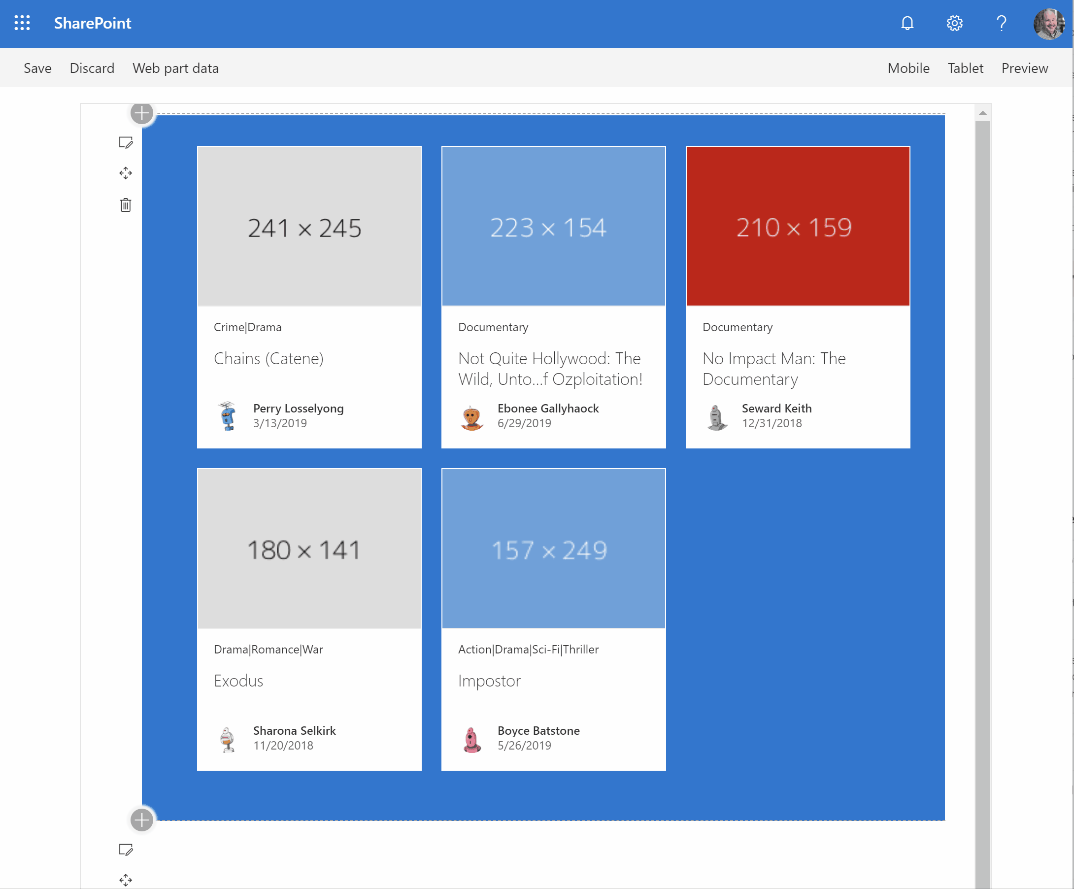
- Use the
GridLayoutcontrol in your code as follows:
 <GridLayout
            ariaLabel="List of content, use right and left arrow keys to navigate, arrow down to access details."
            items={this.state.items}
            onRenderGridItem={(item: any, finalSize: ISize, isCompact: boolean) => this._onRenderGridItem(item, finalSize, isCompact)}
          />
Implementation
The grid layout control can be configured with the following properties:
| Property | Type | Required | Description |
|---|---|---|---|
| ariaLabel | string | no | The accessible text you wish to display for the grid control. We recommend that you use "List of content, use right and left arrow keys to navigate, arrow down to access details.". |
| items | any[] | yes | The array of items you wish to display. |
| listProps | IListProps | no | Provides additional list properties to customize the underlying list. |
| onRenderGridItem | function | yes | onRenderGridItem handler for the grid layout. Use this handler to specify how you wish to render each grid item |
| itemPadding | number | no | Gap between items. |
| itemMinWidth | number | no | Minimum width for each item. |
| itemMaxWidth | number | no | Maximum width for each item. |
| compactThreshold | number | no | Threshold width below which the compact layout is activated. |
| rowsPerPage | number | no | Number of rows displayed per page. |