ChartControl - Line Chart
Line charts represent data values as plotted points on a line.
Example Usage
To create a line chart, add the ChartControl import:
import { ChartControl } from "@pnp/spfx-controls-react/lib/ChartControl";
Then render the ChartControl:
<ChartControl
    type='line'
    data={data}
    options={options}
  />
Alternatively, you can use the following import:
import { ChartControl, ChartType } from '@pnp/spfx-controls-react/lib/ChartControl';
Followed by:
 <ChartControl
    type={ChartType.Line}
    data={data}
    options={options}
  />
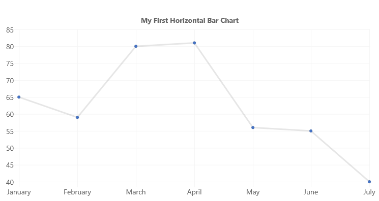
For example, to render the chart above, use the following code:
// set the data
const data: Chart.ChartData = {
  labels:
    [
      'January', 'February', 'March', 'April', 'May', 'June', 'July'
    ],
  datasets: [
    {
      label: 'My First Dataset',
      fill: false,
      lineTension: 0,
      data:
        [
          65, 59, 80, 81, 56, 55, 40
        ]
    }
  ]
};

// set the options
const options: Chart.ChartOptions = {
  legend: {
    display: false,
  },
  title: {
    display: true,
    text: "My First Line Chart"
  }
};

return (
  <ChartControl
    type={ChartType.Line}
    data={data}
    options={options}
  />);
Variations
Curved lines
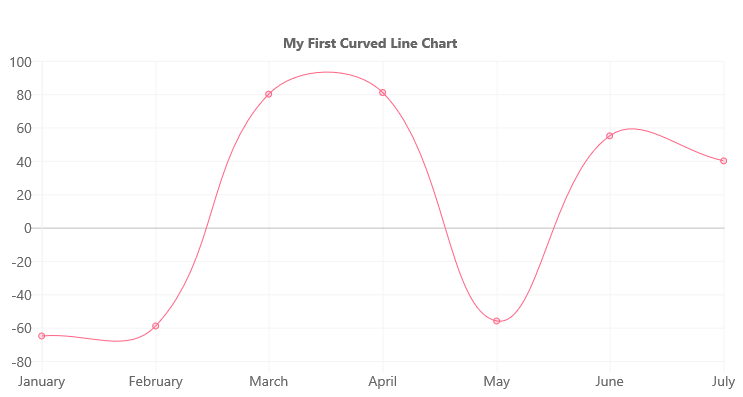
You can render curved lines instead of straight lines by removing the lineTension setting from each dataset, or by setting it to a value other than 0.
For example, to render the above chart, use the following code:
// set the data
const data: Chart.ChartData = {
  labels:
    [
      'January', 'February', 'March', 'April', 'May', 'June', 'July'
    ],
  datasets: [
    {
        label: 'My First Dataset',
        fill: false,
        //lineTension: 0, -- removed
        data:
          [
            -65, -59, 80, 81, -56, 55, 40
          ],
        backgroundColor: "rgba(255, 99, 132, 0.2)",
        borderColor: "rgb(255, 99, 132)",
        borderWidth: 1
      },
  ]
};

// set the options
const options: Chart.ChartOptions = {
  legend: {
    display: false,
  },
  title: {
    display: true,
    text: "My First Curved Line Chart"
  }
};

return (
  <ChartControl
    type={ChartType.Line}
    data={data}
    options={options}
  />);
Area Chart
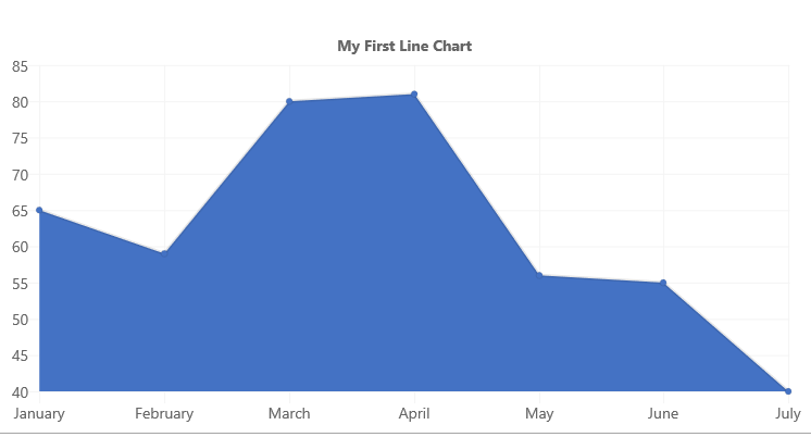
To render an area chart, change the fill setting of the dataset to true.
// set the data
const data: Chart.ChartData = {
  labels:
    [
      'January', 'February', 'March', 'April', 'May', 'June', 'July'
    ],
  datasets: [
    {
      label: 'My First Dataset',
      fill: true,
      lineTension: 0,
      data:
        [
          65, 59, 80, 81, 56, 55, 40
        ]
    }
  ]
};

// set the options
const options: Chart.ChartOptions = {
  legend: {
    display: false,
  },
  title: {
    display: true,
    text: "My First Area Chart"
  }
};

return (
  <ChartControl
    type={ChartType.Line}
    data={data}
    options={options}
  />);
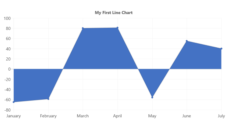
If your chart has negative and positive values, you can control where the filled area by setting the fill setting to one of the following value:
fill Value |
Description | Sample |
|---|---|---|
'start' |
Fill from the bottom of the chart | 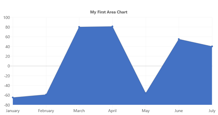 |
'end' |
Fill from the top of the chart | 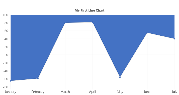 |
'origin' |
Fill from the 'zero' line Same as true |
 |
For example, the code below will set the fill value to start:
// set the data
const data: Chart.ChartData = {
  labels:
    [
      'January', 'February', 'March', 'April', 'May', 'June', 'July'
    ],
  datasets: [
    {
      label: 'My First Dataset',
      fill: 'start',
      lineTension: 0,
      data:
        [
          -65, -59, 80, 81, -56, 55, 40
        ]
    }
  ]
};

// set the options
const options: Chart.ChartOptions = {
  legend: {
    display: false,
  },
  title: {
    display: true,
    text: "My First Area Chart"
  }
};

return (
  <ChartControl
    type={ChartType.Line}
    data={data}
    options={options}
  />);
Which renders the following chart:
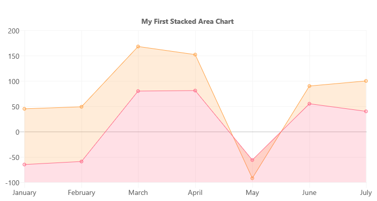
Stacked Area Chart
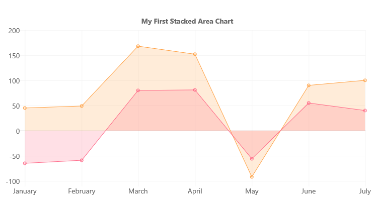
If your bar chart has multiple datasets, you can render it as a stacked area chart by changing the settings on the Y axis to enable stacking, as follows:
const options: Chart.ChartOptions = {
  scales: {
      yAxes: [{
          stacked: true
      }]
  }
};
In order to render each dataset with a different color, make sure to specify the backgroundColor and borderColor settings for each dataset.
For example, to render the above chart, use the following code:
const data: Chart.ChartData = {
  labels:
    [
      'January', 'February', 'March', 'April', 'May', 'June', 'July'
    ],
  datasets: [
    {
      label: 'My First Dataset',
      fill: true,
      lineTension: 0,
      data:
        [
          -65, -59, 80, 81, -56, 55, 40
        ],
      backgroundColor: "rgba(255, 99, 132, 0.2)",
      borderColor: "rgb(255, 99, 132)",
      borderWidth: 1
    },
    {
      label: 'My Second Dataset',
      fill: true,
      lineTension: 0,
      data:
        [
          45, 49, 88, 71, -36, 35, 60
        ],
      backgroundColor: 'rgba(255, 159, 64, 0.2)',
      borderColor: 'rgb(255, 159, 64)',
      borderWidth: 1
    }

  ]
};

const options: Chart.ChartOptions =  {
  legend: {
    display: false,
  },
  title: {
    display: true,
    text: "My First Stacked Area Chart"
  },
  scales: {
    yAxes: [{
      stacked: true
    }]
  }
};

return (
  <ChartControl
    type={ChartType.Line}
    data={data}
    options={options}
  />);
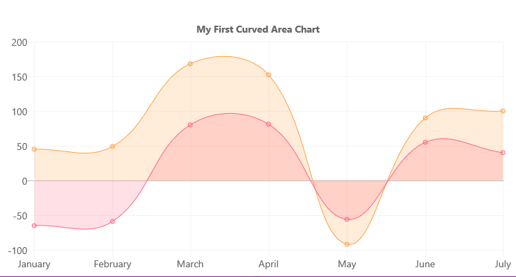
As with lines, you can set the lineTension value to render curved lines instead of straight lines:
In addition to the fill values listed above, you can specify how each dataset fill:
fill Value Type |
Description | Sample Values |
|---|---|---|
| number | Fill to dataset by its absolute index | 1, 2, 3, ... |
| string | Fill to dataset by its relative index | '-3', '-2', '-1', '+1', '+2', '+3', ... |
For example, if you use declare your datasets with the following fill values:
const data: Chart.ChartData = {
      labels:
        [
          'January', 'February', 'March', 'April', 'May', 'June', 'July'
        ],
      datasets: [
        {
          label: 'My First Dataset',
          fill: "start",
          lineTension: 0,
          data:
            [
              -65, -59, 80, 81, -56, 55, 40
            ],
          backgroundColor: "rgba(255, 99, 132, 0.2)",
          borderColor: "rgb(255, 99, 132)",
          borderWidth: 1
        },
        {
          label: 'My Second Dataset',
          fill: '-1',
          lineTension: 0,
          data:
            [
              45, 49, 88, 71, -36, 35, 60
            ],
          backgroundColor: 'rgba(255, 159, 64, 0.2)',
          borderColor: 'rgb(255, 159, 64)',
          borderWidth: 1
        }

      ]
    };
Will cause the first dataset to fill from the bottom of the chart, while the second dataset will fill to the previous dataset (by it's relative index of -1)
Dataset Properties
Line charts allow each dataset to have different configuration properties.
Some properties can be provided as arrays. When arrays are provided, the settings in the array will be applied to each data element in the same order (e.g.: first value applies to first element, second value to second element, etc.)
| Name | Type | Description |
|---|---|---|
| label | string | Dataset label. Appears in the legend and tooltips. |
| xAxisID | string | The axis ID for the X axis. If not specified, the dataset will be rendered on the first available X axis. If an ID is specified, the dataset will be rendered on that axis |
| yAxisID | string | The axis ID for the Y axis. If not specified, the dataset will be rendered on the first available Y axis. If an ID is specified, the dataset will be rendered on that axis |
| backgroundColor | Color OR Color[] | The fill color under the line. |
| borderColor | Color OR Color[] | The color of the line. |
| borderWidth | number OR number[] | The width of the line. Measured in pixels. |
| borderDash | number[] | The length and spacing of dashes. Consist of an array of numbers that specify distances to alternately draw a line and a gap. If array length is odd, elements of the array will be repeated. If an empty array is provided, lines will be solid. |
| borderDashOffset | number | The distance to offset dashes. |
| borderCapStyle | 'butt''round''square' |
Specifies the end of the lines. Default is 'butt'. |
| borderJoinStyle | 'bevel''round''miter' |
Determines the shape used to join two line segments where they meet. Default is 'miter'. |
| cubicInterpolationMode | 'default''monotone' |
Determines which algorithm is used to interpolate a smooth curve between data points. |
| data | number[] Point[] |
The chart's data. Required. |
| fill | falsenumber string 'start''end''origin' |
Controls how the dataset's area is filled. |
| lineTension | number | Tension of the Bézier curve line. 0 renders straight lines. Ignored if cubicInterpolationMode is set to monotone. |
| pointBackgroundColor | Color OR Color[] | The point's fill color. |
| pointBorderColor | Color OR Color[] | The point's border color. |
| pointBorderWidth | number OR number[] | The point's border width. |
| pointRadius | number OR number[] | The point's fill color. |
| pointStyle | 'circle' 'cross''crossRot''dash''line''rect''rectRounded''rectRot''star''triangle'HTMLImageElement HTMLCanvasElement HTMLImageElement[] HTMLCanvasElement[] |
Style of point. |
| pointRotation | number OR number[] | The point's rotation, in degrees. |
| pointHitRadius | number OR number[] | The point's border width. |
| pointHoverBackgroundColor | Color OR Color[] | The point's background color when a mouse hovers over it. |
| pointHoverBorderColor | Color OR Color[] | The point's border color when a mouse hovers over it. |
| pointHoverBorderWidth | number OR number[] | The point's border width when a mouse hovers over it. |
| pointHoverRadius | number OR number[] | The point's radius width when a mouse hovers over it. |
| showLine | boolean | The point's radius width when a mouse hovers over it. |
| spanGaps | boolean | The point's radius width when a mouse hovers over it. |
| steppedLine | boolean'before''after' |
Determines whether the line is shown as a stepped line. Any value but false overrides the lineTension setting. |
Data Structure
number[]
The data property of each dataset item consists of an array of numbers. Each point in the array corresponds to the matching label on the x axis:
data: [20, -10, 33, -47]
The chart elements will be rendered in the same order as found in the array.
Point[]
You can also provide data elements with x and y coordinates:
data: [{
    x: 10,
    y: 20
}, {
    x: 15,
    y: 10
}]
Point Configuration
Point elements can be configured to change their appearance using the following configuration options:
| Name | Type | Default | Description |
|---|---|---|---|
| radius | number | 3 | Point radius. |
| pointStyle | 'circle' 'cross''crossRot''dash''line''rect''rectRounded''rectRot''star''triangle' |
'circle' |
Style of point. |
| rotation | number | 0 | Rotation of the point, in degrees. |
| backgroundColor | Color | 'rgba(0,0,0,0.1) |
Fill color. |
| borderWidth | number | 1 | Stroke width. |
| borderColor | Color | 'rgba(0,0,0,0.1) |
Stroke color. |
| hitRadius | number | 1 | Extra radius added around the point to make it easier to detect mouse events. |
| hoverRadius | number | 4 | Point radius, when mouse hovers over point. |
| hoverBorderWidth | number | 1 | Stroke width, when mouse hovers over point. |
Configuration
The following configuration options are specific to line charts:
| Name | Type | Default | Description |
|---|---|---|---|
| showLines | boolean | true | Indicates whether a line will be drawn between each data point. A value of false will not render lines. |
| spanGaps | boolean | false | Indicates whether invalid number values (NaN) will cause a break in the line . A value of false will not span data gaps and cause a break in the line. |
For More Information
For more information on what options are available with Line charts, refer to the Line Chart documentation on Chart.js.