Dashboard control
Toolbar component for Microsoft Teams.
Note
As this component is based on @fluentui/react-northstar the main usage scenario is Microsoft Teams projects. You can still use it in non-Teams related projects as well.
Here is an example of the control in action:
How to use this control in your solutions
- Check that you installed the
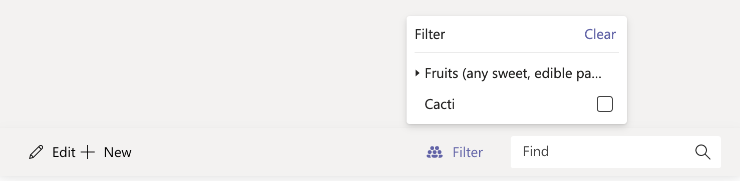
@pnp/spfx-controls-reactdependency. Check out the getting started page for more information about installing the dependency. - Import the following modules to your component:
import { Toolbar } from '@pnp/spfx-controls-react/lib/Toolbar';
- Use the
Toolbarcontrol in your code as follows:
<Toolbar actionGroups={{
    'group1': {
      'action1': {
        title: 'Edit',
        iconName: 'Edit',
        onClick: () => { console.log('Edit action click'); }
      },
      'action2': {
        title: 'New',
        iconName: 'Add',
        onClick: () => { console.log('New action click'); }
      }
    }
  }}
  filters={[{
    id: "f1",
    title:
      "Fruits (any sweet, edible part of a plant that resembles fruit, even if it does not develop from a floral ovary)",
    items: [
      { id: "f1f1", title: "Pomes" },
      { id: "f1f2", title: "Drupes" },
      { id: "f1f3", title: "Citruses" },
      { id: "f1f4", title: "Berries" },
      { id: "f1f5", title: "Melons" },
    ],
  },
  {
    id: "f3",
    title: "Cacti",
  },]}
  find={true} />
Controlled or uncontrolled management of selected filters
The Toolbar component can internally manage the set of selected filters (uncontrolled) or the set of selected filters can be defined using property, selectedFilterIds(controlled).
If property selectedFilterIds is undefined then the set of selected filter IDs is uncontrolled and the Toolbar will initialise with an empty set of selected filters. As the user toggles the Toolbar's filters the function set on property, onSelectedFiltersChange, will be called with an array parameter of the currently selected filter IDs. The implementation of this function can return void or an array of filter IDs that the Toolbar should set. By returning an array of filter IDs the onSelectedFiltersChange implementation can alter the selected filters of an uncontrolled Toolbar in response to user attempts to set/clear filters.
If the selectedFilterIds property is defined then the set of selected filter IDs is controlled and the Toolbar shall display selected filters according the contents of the array property. The onSelectedFiltersChange function will still be called, but the returned value will have no effect on the filters displayed as selected by the Toolbar.
Implementation
The Toolbar component can be configured with the following properties:
| Property | Type | Required | Description |
|---|---|---|---|
| actionGroups | TActionGroups | yes | Toolbar actions groups. |
| filters | TFilters | no | Toolbar filters. |
| find | boolean | no | Specifies if searchbox should be displayed. |
| filtersSingleSelect | boolean | no | Specifies if a user can select only one filter at a time. |
| onSelectedFiltersChange | (selectedFilters: string[]) => (string[] | void) | no | Filter changed handler. Called when user toggles selection of a filter. |
| selectedFilterIds | string[] | no | Specifies the IDs of the filters which should be displayed as selected by the Toolbar. |
| onFindQueryChange | (findQuery: string) => string | no | Search query changed handler. |
Type TActionGroups
Provides Toolbar action groups settings.
type TActionGroups = {
    [slug: string]: TActions;
};
Type TActions
Provides Toolbar actions settings.
type TActions = {
    [actionKey: string]: TAction;
};
Type TAction
Provides Toolbar action settings.
| Property | Type | Required | Description |
|---|---|---|---|
| title | string | yes | Action title. |
| iconName | string | no | Action icon name. |
| multi | boolean | no | For future. |
| onClick | ComponentEventHandler<ToolbarItemProps> | no | Action onClick handler. |
Type TFilters
Provides Toolbar filters settings.
type TFilters = ObjectShorthandCollection<TreeItemProps, never>;