Enhanced Theme Provider
The reasons behind this control are many and concern the use of Fluent UI controls currently officially supported by SPFx, that is:
Problems with Teams theme support, when hosting a web part like Tab or Personal App and specifically the lack of support by this version of Fluent UI React of the high contrast theme.Lack of basic style, such as fonts, for basic HTML elements when creatingweb parts hosted in Teams as Tabs or personal App.- Lack of basic style, such as fonts, for basic HTML elements when creating
web parts in "isDomainIsolated" mode, aka the Isolated web parts.
Therefore, the control is to be considered as a sort of wrapper for all react and non-react controls that you want to add to the web part.
The control extends the functionality of the Fluent UI ThemeProvider control (currently in version 7) by adding some logic thanks to the information contained in the 'context' property, that is:
- If the web part is hosted inside SharePoint, the theme passed through the 'Theme' property will be used or the default one of the current site will be taken.
- If the web part is hosted within Teams, the "Theme" property will be ignored and using the "Context" property checks which theme is currently applied and adds a handler to notify when the theme is changed. This allows you to manage the change of theme in Teams in real-time, without having to reload the Tab or the Personal App.
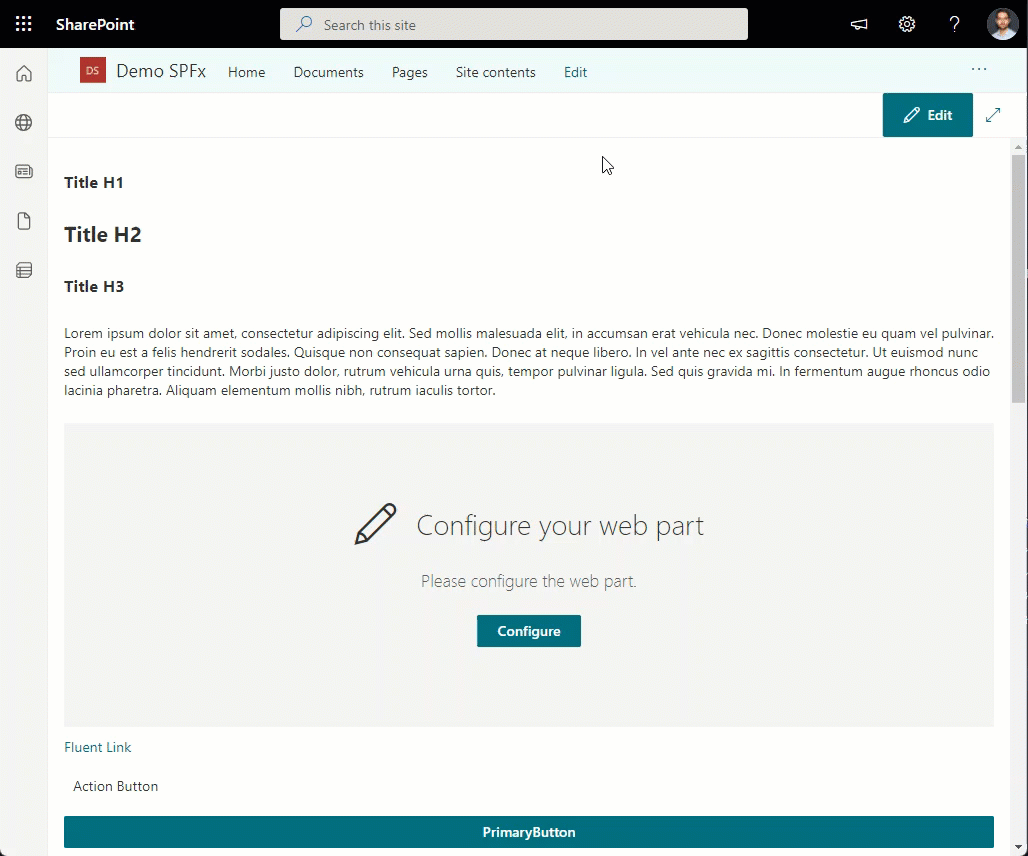
Example of use in SharePoint in a SharePointFullPage - Isolated web parts (note that the titles H1, H2, H3 and the paragraph are normal html tags that automatically take the font and color style from the control):
As for Teams, given the inconsistency of the theme system of Fluent UI NorthStar (used in Teams) and Fluent UI React (used by SPFx), the themes are "emulated".
The control contains the refining of Teams' Default, Dark and High Contrast themes.
The Default and Dark themes were created simply using the Fluent UI Themes designer and the primary colors of their corresponding Teams themes.
For the High Contrast theme, on the other hand, given the complexity of creating a completely new theme and above all in High Contrast mode (neither supported nor gives SharePoint nor gives Fluent UI v7), it was decided to create the theme by hand and support only "main controls".
This means that this theme is not perfect and above all not all controls will be displayed correctly.
This is not a big deal, as the same theme provided by SharePoint has the same problems, it does not support High Contrast rendering for all controls.
For the High Contrast theme (in Teams), only these controls are supported by this control: ChoiceGroup, Checkbox, ComboBox, DatePicker, SpinButton, TextField, Toggle, PrimaryButton, DefaultButton, CompoundButton, IconButton, other fluent controls may have color rendering problems.
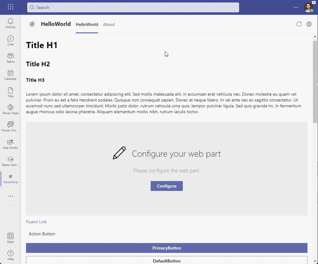
Example of use in Teams as a TeamsPersonalApp (note that the titles H1, H2, H3 and the paragraph are normal html tags that automatically take the font and color style from the control):
How to use this control in your solutions
- Check that you installed the
@pnp/spfx-controls-reactdependency. Check out the getting started page for more information about installing the dependency. - In your component file, import the
EnhancedThemeProvidercontrol as follows:
import { EnhancedThemeProvider, getDefaultTheme, useTheme, ThemeContext } from "@pnp/spfx-controls-react/lib/EnhancedThemeProvider";
- Example on use the
EnhancedThemeProvidercontrol with only required properties:
<EnhancedThemeProvider context={this.props.context}>
  {/* controls to apply the theme to */}
</EnhancedThemeProvider>
- Example on use the
EnhancedThemeProvidercontrol with the most important properties:
<EnhancedThemeProvider applyTo="element" context={this.props.context} theme={this.props.themeVariant}>
  {/* controls to apply the theme to */}
</EnhancedThemeProvider>
The control provides the passage and/or creation of the theme according to what has been said before. In order to access the theme, from child controls, there are two modes, one for function-based controls, one for class-based controls.
- Access the theme from the child control using a function component:
export const ChildFunctionComponent = () => {
  const theme = useTheme();

  return (
    <DefaultButton theme={theme}>Example Child Control</DefaultButton>
  );
}
- Access the theme from the child control using a class component:
export class ChildClassComponent extends React.Component {
  public render() {
    return (
      <ThemeContext.Consumer>
        {theme =>
          <DefaultButton theme={theme}>Example Child Control</DefaultButton>
        }
      </ThemeContext.Consumer>
    )
  }
};
- Usage example using theme in child controls:
<EnhancedThemeProvider applyTo="element" context={this.props.context} theme={this.props.themeVariant}>
  <ChildFunctionComponent />
  <ChildClassComponent />
</EnhancedThemeProvider>
Implementation
The EnhancedThemeProvider control can be configured with the following properties:
| Property | Type | Required | Description |
|---|---|---|---|
| context | BaseComponentContext | yes | Sets the context from the SPFx component (a web part, an application customizer or a form customizer). |
| as | React.ElementType | no | A component that should be used as the root element of the ThemeProvider component. |
| ref | React.Ref<HTMLElement> | no | Optional ref to the root element. |
| theme | PartialTheme | Theme | no | Defines the theme provided by the user. |
| renderer | StyleRenderer | no | Optional interface for registering dynamic styles. Defaults to using merge-styles. Use this to opt into a particular rendering implementation, such as emotion, styled-components, or jss. Note: performance will differ between all renders. Please measure your scenarios before using an alternative implementation. |
| applyTo | 'element' | 'body' | 'none' | no | Defines where body-related theme is applied to. Setting to 'element' will apply body styles to the root element of ThemeProvider. Setting to 'body' will apply body styles to document body. Setting to 'none' will not apply body styles to either element or body. |