Carousel control
A slideshow component for cycling through elements—images or slides of text—like a carousel.
Here is an example of the control in action:
How to use this control in your solutions
- Check that you installed the
@pnp/spfx-controls-reactdependency. Check out the getting started page for more information about installing the dependency. - Import the following modules to your component:
import { Carousel } from "@pnp/spfx-controls-react/lib/Carousel";
- Use the
Carouselcontrol in your code as follows:
Carousel component with provided JSX.Element[] slides
<Carousel
  buttonsLocation={CarouselButtonsLocation.top}
  buttonsDisplay={CarouselButtonsDisplay.block}

  contentContainerStyles={styles.carouselContent}
  containerButtonsStyles={styles.carouselButtonsContainer}

  isInfinite={true}

  element={this.carouselElements}
  onMoveNextClicked={(index: number) => { console.log(`Next button clicked: ${index}`); }}
  onMovePrevClicked={(index: number) => { console.log(`Prev button clicked: ${index}`); }}
/>
Carousel component with provided triggerPageEvent
<Carousel
  buttonsLocation={CarouselButtonsLocation.bottom}
  buttonsDisplay={CarouselButtonsDisplay.buttonsOnly}

  contentContainerStyles={styles.carouselContent}
  containerButtonsStyles={styles.carouselButtonsContainer}

  canMoveNext={this.state.canMoveNext}
  canMovePrev={this.state.canMovePrev}
  triggerPageEvent={this.triggerNextElement}
  element={this.state.currentCarouselElement}
/>
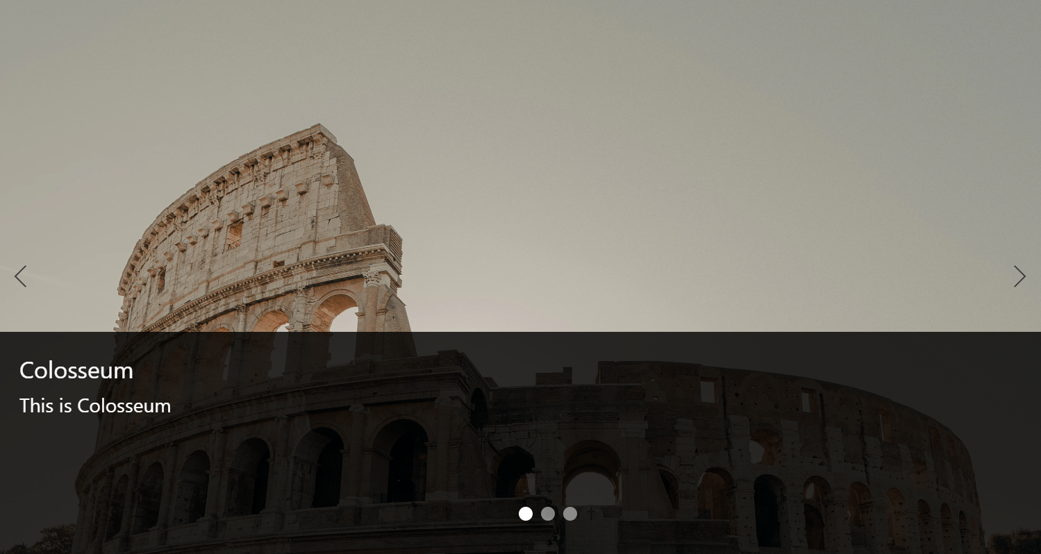
Carousel component with provided ICarouselImageProps[] slides:
<Carousel
  buttonsLocation={CarouselButtonsLocation.center}
  buttonsDisplay={CarouselButtonsDisplay.buttonsOnly}
  contentContainerStyles={styles.carouselImageContent}
  isInfinite={true}
  indicatorShape={CarouselIndicatorShape.circle}
  pauseOnHover={true}

  element={[
    {
      imageSrc: 'https://images.unsplash.com/photo-1588614959060-4d144f28b207?ixlib=rb-1.2.1&ixid=eyJhcHBfaWQiOjEyMDd9&auto=format&fit=crop&w=3078&q=80',
      title: 'Colosseum',
      description: 'This is Colosseum',
      url: 'https://en.wikipedia.org/wiki/Colosseum',
      showDetailsOnHover: true,
      imageFit: ImageFit.cover
    },
    {
      imageSrc: 'https://images.unsplash.com/photo-1588614959060-4d144f28b207?ixlib=rb-1.2.1&ixid=eyJhcHBfaWQiOjEyMDd9&auto=format&fit=crop&w=3078&q=80',
      title: 'Colosseum',
      description: 'This is Colosseum',
      url: 'https://en.wikipedia.org/wiki/Colosseum',
      showDetailsOnHover: true,
      imageFit: ImageFit.cover
    }
  ]}
  onMoveNextClicked={(index: number) => { console.log(`Next button clicked: ${index}`); }}
  onMovePrevClicked={(index: number) => { console.log(`Prev button clicked: ${index}`); }}
/>
Implementation
The Carousel component can be configured with the following properties:
| Property | Type | Required | Description |
|---|---|---|---|
| startIndex | number | no | Specifies the initial index of the element to be displayed. |
| isInfinite | boolean | no | Indicates if infinite scrolling is enabled. |
| canMoveNext | boolean | no | Property indicates if the next item button can be clicked. If not provided, status of the button is calculated based on the current index. It is mandatory when triggerPageEvent is used. |
| canMovePrev | boolean | no | Property indicates if the previous item button can be clicked. If not provided, status of the button is calculated based on the current index. It is mandatory when triggerPageEvent is used. |
| buttonsLocation | CarouselButtonsLocation | no | Specifies the location of the buttons inside the container. Default: center |
| buttonsDisplay | CarouselButtonsDisplay | no | Specifies the buttons container display mode. Default: block |
| containerStyles | ICssInput | no | Allows to specify own styles for carousel container. |
| loadingComponentContainerStyles | ICssInput | no | Allows to specify own styles for loading component. |
| contentContainerStyles | ICssInput | no | Allows to specify own styles for elements container. |
| containerButtonsStyles | ICssInput | no | Allows to specify own styles for buttons container. |
| prevButtonStyles | ICssInput | no | Allows to specify own styles for previous item button. |
| nextButtonStyles | ICssInput | no | Allows to specify own styles for next item button. |
| prevButtonIconName | string | no | Name of the icon to be used for PreviousItem button. Default 'ChevronLeft'. |
| nextButtonIconName | string | no | Name of the icon to be used for NextItem button. Default 'ChevronRight'. |
| triggerPageEvent | (index: number) => void | no | Triggers parent control to provide new element to be displayed. After the method is executed, carousel control switches to processing mode and loadingComponent is displayed. |
| element | JSX.Element | JSX.Element[] | yes | Fixed array of elements to be displayed in carousel - if triggerPageEvent is not used. In case triggerPageEvent is in use, JSX.Element has to be provided. Elements are distinguished based on the 'key' property. |
| loadingComponent | JSX.Element | no | Allows to inject custom component when the carousel is in processing state. If not provided, Spinner is displayed. |
| onMoveNextClicked | (currentIndex: number) => void | no | Callback function called after the next item button is clicked. Not used when triggerPageEvent is specified. |
| onMovePrevClicked | (currentIndex: number) => void | no | Callback function called after the previous item button is clicked. Not used when triggerPageEvent is specified. |
| elementsCount | number | no | In case triggerPageEvent is in use, provides total number of slides in the carousel. |
| onSelect | (selectedIndex: number) => void | no | Callback function called when element has been selected in the carousel |
| slide | boolean | no | Enables animation on the Carousel as it transitions between slides. This property is ignored if triggerPageEvent is in use. |
| interval | number | null | no | The amount of time to delay between automatically cycling an item. If null, carousel will not automatically cycle. |
| pauseOnHover | boolean | no | Specifies if slides cycling should pause when hovering over the content (touchStart on touch devices). |
| indicators | boolean | no | Specifies if set of slide position indicators is shown. |
| indicatorShape | CarouselIndicatorShape | no | Specifies indicators' shape. If onRenderIndicator is provided - this property is ignored |
| indicatorClassName | string | no | Specifies additional class applied to slide position indicators |
| indicatorStyle | React.CSSProperties | no | Specifies additional styles applied to slide position indicators |
| onRenderIndicator | (index: number, onClick: (e: React.MouseEvent<HTMLElement> | React.TouchEvent<HTMLElement>, selectedIndex: number) => void) => JSX.Element | no | Function to render indicator element |
| indicatorsDisplay | CarouselIndicatorsDisplay | no | Specifies display mode of the indicators. Default value overlap. |
| rootStyles | ICssInput | no | Allows to specify own styles for root element |
| indicatorsContainerStyles | ICssInput | no | Allows to specify own styles for indicators container when indicatorsDisplay is set to "block" |
| prevButtonAriaLabel | string | no | Aria label of the PreviousItem button. Default 'Previous item'. |
| nextButtonAriaLabel | string | no | Aria label of the NextItem button. Default 'Next item'. |
| contentHeight | number | no | Allows to specify the height of the content. Can be used instead of providing styles for the content container (contentContainerStyles). |
enum CarouselButtonsLocation
Provides options for carousel buttons location.
| Value | Description |
|---|---|
| top | Buttons are going to be placed in the top of the control. |
| center | Buttons are going to be placed in the center of the control. |
| bottom | Buttons are going to be placed in the bottom of the control. |
enum CarouselButtonsDisplay
Provides options for carousel buttons display mode.
| Value | Description |
|---|---|
| block | Reserves space for buttons on both sides of the control. |
| buttonsOnly | Only icon buttons are displayed. |
| hidden | Buttons are not displayed. They appear onHover event. |
enum CarouselIndicatorShape
Provides options for carousel indicators' shape.
| Value | Description |
|---|---|
| circle | Indicators displayed as circles |
| square | Indicators displayed as squares |
| rectangle | Indicators displayed as rectangles |
enum CarouselIndicatorsDisplay
Provides options for carousel indicators display mode.
| Value | Description |
|---|---|
| overlap | Indicators are displayed on top of the carousel content |
| block | Reserves space for indicators |
Interface ICarouselImageProps
Allows to easily render a set of CarouselImage components in the carousel
| Property | Type | Required | Description |
|---|---|---|---|
| imageSrc | string | yes | Image source |
| imageFit | ImageFit | no | Specifies the method to be used to fit image. Default: ImageFit.none. See Fluent UI Image |
| url | string | no | URL to be opened when clicking on details |
| title | string | no | Title to display in details |
| description | string | JSX.Element | no | Description to show in details. Can be either a string (text) or JSX.Element to show HTML. |
| target | "_blank" | "_self" | no | Target of the URL to open. Default "_blank" |
| showDetailsOnHover | boolean | no | Specifies if the details are shown on hover or constantly |
| className | string | no | Class to apply to the component |
| style | React.CSSProperties | no | Styles to apply to the component |
| imgClassName | string | no | Class to apply to the image control |
| imgStyle | React.CSSProperties | no | Styles to apply to the image control |
| detailsClassName | string | no | Class to apply to the details control |
| detailsStyle | React.CSSProperties | no | Styles to apply to the details control |
| titleClassName | string | no | Class to apply to the title control |
| titleStyle | React.CSSProperties | no | Styles to apply to the title control |
| descriptionClassName | string | no | Class to apply to the description control |
| descriptionStyle | React.CSSProperties | no | Styles to apply to the description control |