ListItemAttachments control
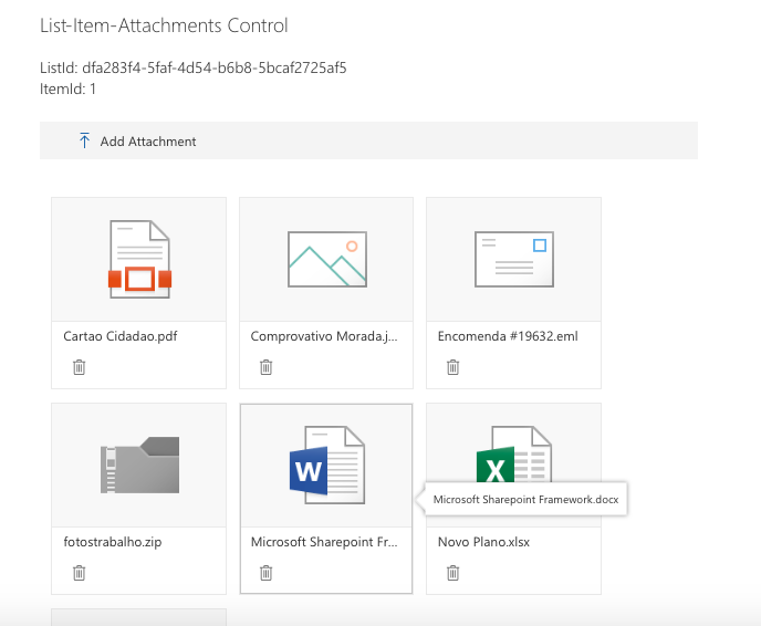
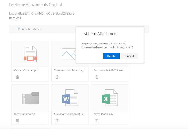
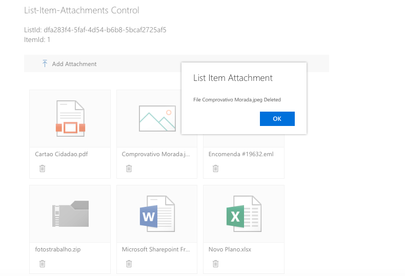
This control allows you to manage list item attachments, you can add or delete associated attachments. The attachments can be displayed in different modes: tiles (default), list, or compact list.
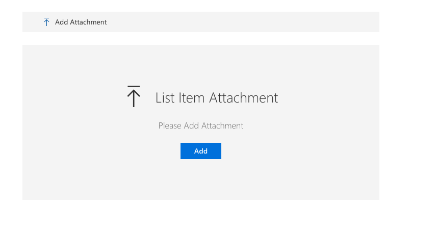
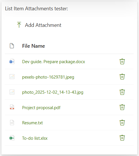
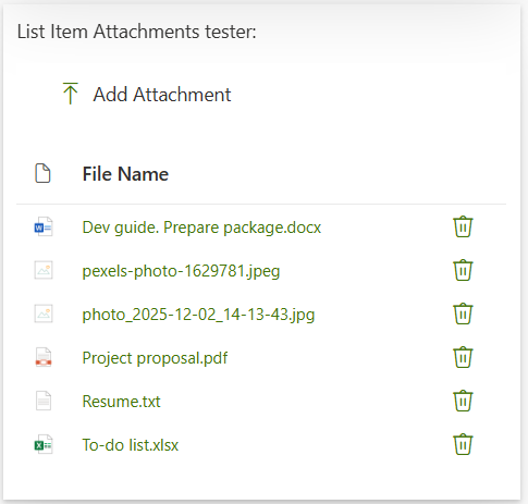
Here is an example of the control:
How to use this control in your solutions
- Check that you installed the
@pnp/spfx-controls-reactdependency. Check out the getting started page for more information about installing the dependency. - Import the control into your component:
import { ListItemAttachments } from '@pnp/spfx-controls-react/lib/ListItemAttachments';
- Use the
ListItemAttachmentscontrol in your code as follows:
<ListItemAttachments listId='dfa283f4-5faf-4d54-b6b8-5bcaf2725af5'
                     itemId={1}
                     context={this.props.context}
                     disabled={false} />
- You can customize the display mode of attachments. Import the
AttachmentsDisplayModeenum and use it:
import { ListItemAttachments, AttachmentsDisplayMode } from '@pnp/spfx-controls-react/lib/ListItemAttachments';

// Tiles view (default)
<ListItemAttachments listId='dfa283f4-5faf-4d54-b6b8-5bcaf2725af5'
                     itemId={1}
                     context={this.props.context}
                     displayMode={AttachmentsDisplayMode.Tiles} />

// List view
<ListItemAttachments listId='dfa283f4-5faf-4d54-b6b8-5bcaf2725af5'
                     itemId={1}
                     context={this.props.context}
                     displayMode={AttachmentsDisplayMode.DetailsList} />

// Compact list view
<ListItemAttachments listId='dfa283f4-5faf-4d54-b6b8-5bcaf2725af5'
                     itemId={1}
                     context={this.props.context}
                     displayMode={AttachmentsDisplayMode.DetailsListCompact} />
- If you want to use
ListItemAttachmentscontrols with new form you have to use React.createRef.
Following example will add selected attachments to list item with id = 1
let listItemAttachmentsComponentReference = React.createRef<ListItemAttachments>();
...
      <ListItemAttachments
        ref={listItemAttachmentsComponentReference}
        context={this.props.context}
        listId="dfcfdb95-2488-4757-b55b-14d94166ad87"
        itemId={0} />
...
<PrimaryButton text="Save to Item with id 1" onClick={()=>{
        //@ts-ignore
        listItemAttachmentsComponentReference.current.uploadAttachments(1);
      }} />
Implementation
The ListItemAttachments control can be configured with the following properties:
| Property | Type | Required | Description |
|---|---|---|---|
| context | BaseComponentContext | yes | SPFx web part or extension context |
| itemId | number | no | List Item Id |
| listId | string | yes | Guid of the list. |
| webUrl | string | no | URL of the site. By default it uses the current site URL. |
| label | string | no | Main text to display on the placeholder, next to the icon. |
| description | string | no | Description text to display on the placeholder, below the main text and icon. |
| displayMode | AttachmentsDisplayMode | no | Display mode for rendering attachments. Options: AttachmentsDisplayMode.Tiles (default), AttachmentsDisplayMode.DetailsList, or AttachmentsDisplayMode.DetailsListCompact. |
| disabled | boolean | no | Specifies if the control is disabled or not. |
| openAttachmentsInNewWindow | boolean | no | Specifies if the attachment should be opened in a separate browser tab. Use this property set to true if you plan to use the component in Microsoft Teams. |
| onAttachmentChange | (itemData: any) => void | no | Callback function invoked when attachments are added or removed. Receives the updated item data including the new ETag. This is useful when using the control within a form (like DynamicForm) that tracks ETags for optimistic concurrency control. |
enum AttachmentsDisplayMode
Display mode for rendering attachments.
| Value | Description |
|---|---|
| Tiles | Displays attachments as tiles/thumbnails using DocumentCard components. This is the default mode. |
| DetailsList | Displays attachments in a list format with file type icons, file names, and delete actions. |
| DetailsListCompact | Displays attachments in a compact list format with reduced row height and padding. |
Usage with DynamicForm
When using ListItemAttachments within a DynamicForm or any component that uses ETags for optimistic concurrency control, you should use the onAttachmentChange callback to update the ETag when attachments are modified:
import * as React from 'react';
import { DynamicForm } from '@pnp/spfx-controls-react/lib/DynamicForm';
import { ListItemAttachments } from '@pnp/spfx-controls-react/lib/ListItemAttachments';

export class MyFormComponent extends React.Component<any, any> {
  private dynamicFormRef = React.createRef<DynamicForm>();

  /**
   * Callback invoked when attachments are added or removed
   * Updates the ETag in DynamicForm to prevent 412 conflicts
   */
  private onAttachmentChange = (itemData: any): void => {
    if (this.dynamicFormRef.current) {
      this.dynamicFormRef.current.updateETag(itemData);
    }
  }

  public render(): React.ReactElement {
    return (
      <div>
        <ListItemAttachments
          listId={listId}
          itemId={itemId}
          context={this.props.context}
          onAttachmentChange={this.onAttachmentChange}
        />

        <DynamicForm
          ref={this.dynamicFormRef}
          context={this.props.context}
          listId={listId}
          listItemId={itemId}
          respectETag={true}
        />
      </div>
    );
  }
}
This prevents 412 ETag conflict errors when saving the form after adding or removing attachments.