DateTimePicker control
This control allows you to select dates from a calendar and optionally the time of day using dropdown controls. You can configure the control to use 12 or 24-hour clock.
Here are some examples of the control:
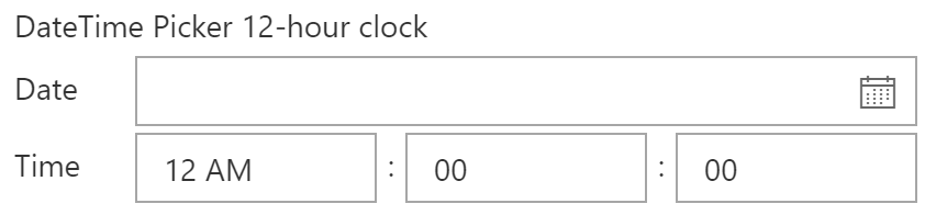
DateTime Picker 12-hour clock
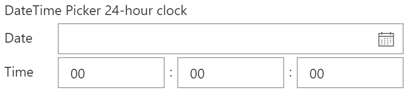
DateTime Picker 24-hour clock
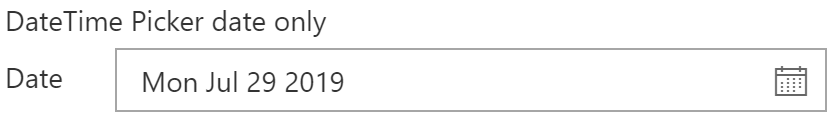
DateTime Picker Date Only
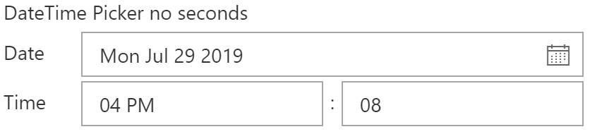
DateTime Picker No Seconds
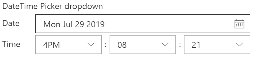
DateTime Picker Dropdowns for Time Part
How to use this control in your solutions
- Check that you installed the
@pnp/spfx-controls-reactdependency. Check out the getting started page for more information about installing the dependency. - Import the control into your component. The DateConvention and TimeConvention controls if the time of day controls are shown and the time format used (12 hours/24 hours).
import { DateTimePicker, DateConvention, TimeConvention } from '@pnp/spfx-controls-react/lib/DateTimePicker';
- Use the
DateTimePickercontrol in your code as follows, either as an uncontrolled or a controlled component:
// Uncontrolled
<DateTimePicker label="DateTime Picker - 12h"
                dateConvention={DateConvention.DateTime}
                timeConvention={TimeConvention.Hours12} />

// Controlled
<DateTimePicker label="DateTime Picker - 24h"
                dateConvention={DateConvention.DateTime}
                timeConvention={TimeConvention.Hours24}
                value={this.state.date}
                onChange={this.handleChange} />
Implementation
The DateTimePicker control can be configured with the following properties:
| Property | Type | Required | Description |
|---|---|---|---|
| label | string | no | Property field label displayed on top. |
| disabled | boolean | no | Specifies if the control is disabled or not. |
| formatDate | function | no | Defines a formatDate function that can override the output value in Date picker. |
| parseDateFromString | function | no | Optional method to parse the text input value to date, it is only useful when allowTextInput is set to true |
| dateConvention | DateConvention | no | Defines the date convention to use. The default is date and time. |
| timeConvention | TimeConvention | no | Defines the time convention to use. The default value is the 24-hour clock convention. |
| firstDayOfWeek | DayOfWeek | no | Specify the first day of the week for your locale. |
| firstWeekOfYear | FirstWeekOfYear | no | Defines when the first week of the year should start. |
| key | string | no | A unique key that indicates the identity of this control |
| onGetErrorMessage | function | no | The method is used to get the validation error message and determine whether the input value is valid or not. See this documentation to learn how to use it. |
| showGoToToday | boolean | no | Controls whether the "Go to today" link should be shown or not |
| isMonthPickerVisible | boolean | no | Controls whether the month picker is shown beside the day picker or hidden. |
| showMonthPickerAsOverlay | boolean | no | Show month picker on top of date picker when visible. |
| showWeekNumbers | boolean | no | Controls whether the calendar should show the week number (weeks 1 to 53) before each week row |
| allowTextInput | boolean | no | Whether the user is allowed to enter a date as text instead of picking one from the date picker. |
| strings | IDatePickerStrings | no | Localized strings to use in the DateTimePicker |
| value | Date | no | Default value of the DatePicker, if any |
| onChange | function | no | Callback issued when date or time is changed |
| showSeconds | boolean | no | Specifies, if seconds dropdown should be shown, defaults to false. |
| timeDisplayControlType | TimeDisplayControlType | no | Specifies what type of control to use when rendering time part. |
| showLabels | boolean | no | Specifies if labels in front of date and time parts should be rendered. |
| placeholder | string | no | Placeholder text for the DatePicker. |
| initialPickerDate | Date | no | The initially highlighted date in the calendar picker |
| maxDate | Date | no | The maximum allowable date. |
| minDate | Date | no | The minimum allowable date. |
| minutesIncrementStep | MinutesIncrement | no | Specifies minutes' increment step for TimeDisplayControlType.Dropdown |
| showClearDate | boolean | no | Controls whether the clearDate iconButton must be available when date is selected, default to false |
| showClearDateIcon | string | no | Controls the icon used for clearDate iconButton. Defaults to 'RemoveEvent' |
| restrictedDates | Date[] | no | If set the Calendar will not allow selection of dates in this array. |
Enum TimeDisplayControlType
| Name | Description |
|---|---|
| Text | Renders Time part as Masked Edit |
| Dropdown | Renders Time part as Dropdown |
Enum DateConvention
| Name | Description |
|---|---|
| DateTime | Shows the date and time picker |
| Date | Shows only the date picker |
Enum TimeConvention
| Name | Description |
|---|---|
| Hours12 | Specify the hours in 12-hours (AM / PM) time convention. |
| Hours24 | Specify the hours in 24-hours time convention. |
Interface IDateTimePickerStrings extends IDatePickerStrings
| Property | Type | Required | Description |
|---|---|---|---|
| dateLabel | string | no | Label for the date selector. |
| timeLabel | string | no | Label for the time of day selector. |
| timeSeparator | string | no | Separator between time of day components (hours, minutes, seconds). |
| amDesignator | string | no | Used as AM designator when 12-hour clock is used. |
| pmDesignator | string | no | Used as PM designator when 12-hour clock is used. |
| textErrorMessage | string | no | Error message when text is entered in the date picker. |
Type MinutesIncrement
type MinutesIncrement = 1 | 5 | 10 | 15 | 30;