ListItemPicker control
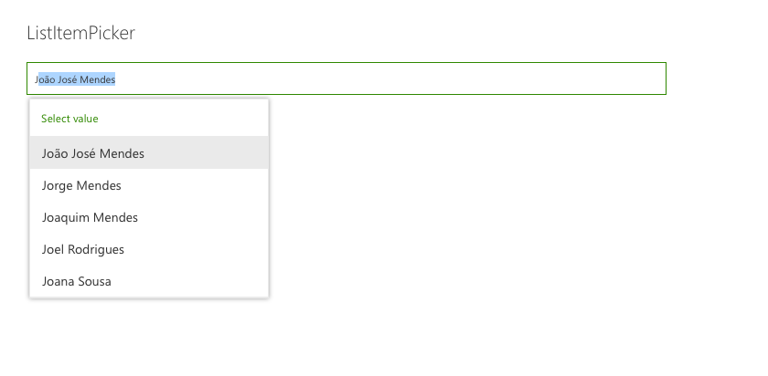
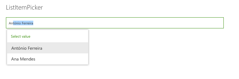
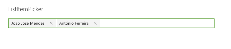
This control allows you to select one or more items from a list. The List can be filtered to allow select items from a subset of items The item selection is based from a column value. The control will suggest items based on the inserted value.
Here is an example of the control:
How to use this control in your solutions
- Check that you installed the
@pnp/spfx-controls-reactdependency. Check out the getting started page for more information about installing the dependency. - Import the control into your component:
import { ListItemPicker } from '@pnp/spfx-controls-react/lib/ListItemPicker';
- Use the
ListItemPickercontrol in your code as follows:
<ListItemPicker listId='da8daf15-d84f-4ab1-9800-7568f82fed3f'
                columnInternalName='Title'
                keyColumnInternalName='Id'
                filter="Title eq 'SPFx'"
                orderBy={"Id desc"}
                itemLimit={2}
                onSelectedItem={this.onSelectedItem}
                context={this.props.context} />
- The
onSelectedItemchange event returns the list items selected and can be implemented as follows:
private onSelectedItem(data: { key: string; name: string }[]) {
  for (const item of data) {
    console.log(`Item value: ${item.key}`);
    console.log(`Item text: ${item.name}`);
  }
}
Implementation
The ListItemPicker control can be configured with the following properties:
| Property | Type | Required | Description |
|---|---|---|---|
| columnInternalName | string | yes | InternalName of column to search and get values. |
| keyColumnInternalName | string | no | InternalName of column to use as the key for the selection. Must be a column with unique values. Default: Id |
| context | BaseComponentContext | yes | SPFx web part or extension context |
| listId | string | yes | Guid or title of the list. |
| itemLimit | number | yes | Number of items which can be selected |
| onSelectedItem | (items: any[]) => void | yes | Callback function which returns the selected items. |
| className | string | no | ClassName for the picker. |
| webUrl | string | no | URL of the site. By default it uses the current site URL. |
| defaultSelectedItems | any[] | no | Initial items that have already been selected and should appear in the people picker. |
| suggestionsHeaderText | string | no | The text that should appear at the top of the suggestion box. |
| noResultsFoundText | string | no | The text that should appear when no results are returned. |
| disabled | boolean | no | Specifies if the control is disabled or not. |
| filter | string | no | condition to filter list Item, same as $filter OData parameter |
| orderBy | string | no | condition to order by list Item, same as $orderby OData parameter |
| placeholder | string | no | Short text hint to display in empty picker |
| substringSearch | boolean | no | Specifies if substring search should be used |
| label | string | no | Specifies the text describing the ListItemPicker. |
| enableDefaultSuggestions | boolean | no | Enable default suggestions. All options are displayed by default when clicking on the control. |
| itemsQueryCountLimit | number | no | Number of items to display in a lookup field |