Adaptive Card Designer Host
This control allows you to embed the official Adaptive Cards designer inside a React SPFx solution.
The control consists of 2 components:
- AdaptiveCardDesigner: implements all the logic to embed the designer control as a React component;
- AdaptiveCardDesignerHost: main control to render the designer in a full page Fluent UI panel;
Due to the nature in which the original Adaptive Card Designer control was implemented, it is not possible at this time to adapt it to the current theme applied to the site and especially to localize it to give multilingual support. The designer, therefore, is only available in the English language.
This control shares a lot of code with another control in this library, the "AdaptiveCardHost" control. In this way you have a uniformity of display between the cards created with this designer and those rendered with "AdaptiveCardHost". The same thing goes for the various HostContainer objects, so that you can test the cards with the themes available for "AdaptiveCardHost".
The Adaptive Cards version supported is 1.5, by using the 'adaptivecards' npm package version 2.10.0.
All Inputs Elements and Actions of Adaptive Cards have been redefined using Fluent UI React, adding and improving features that are not managed in Microsoft's implementation of the "adaptivecards-fluentui" library (Theme support for example).
Thanks to the "context" property that allows you to pass the SPFx context, whether the "data" property is passed or not, a new field called @context will be injected into the data object.
This allows, using Adaptive Cards templating syntax and binding feature of the Designer, to access to the context information.
For more info please to refer to the documentation of AdaptiveCardHost control
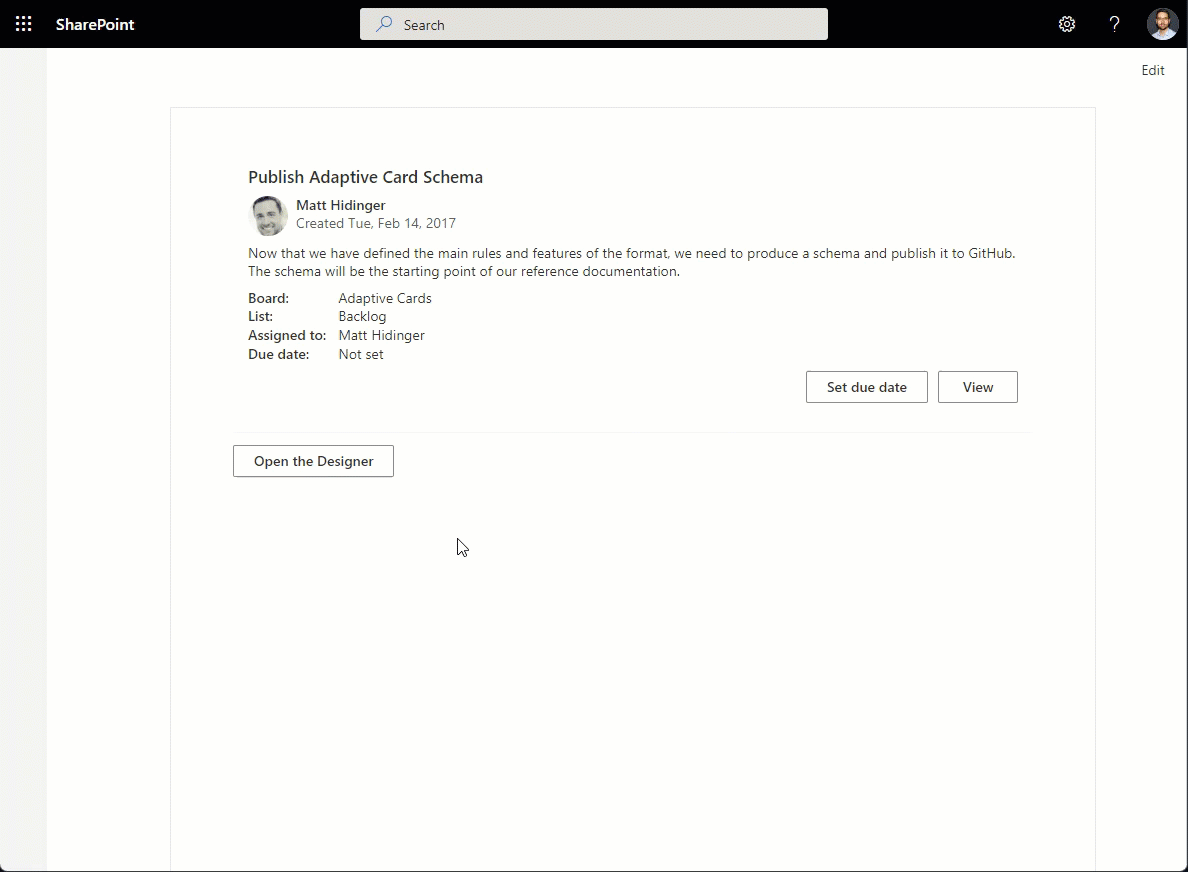
Here is an example of the control in action inside a Web Part:
How to use this control in your solutions
-
Check that you installed the
@pnp/spfx-controls-reactdependency. Check out the getting started page for more information about installing the dependency. -
In your component file, import the
AdaptiveCardDesignerHostcontrol as follows:
import { AdaptiveCardDesignerHost, HostContainer, BindingPreviewMode, Versions } from "@pnp/spfx-controls-react/lib/AdaptiveCardDesignerHost";
- Example on use the
AdaptiveCardDesignerHostcontrol with only required properties:
<AdaptiveCardDesignerHost
  headerText="Adaptive Card Designer"
  buttonText="Open the Designer"
  context={props.context}
  onSave={(payload: object) => setCard(payload)}
/>
- Example on use the
AdaptiveCardDesignerHostcontrol with all properties:
<AdaptiveCardDesignerHost
  headerText="Adaptive Card Designer"
  buttonText="Open the Designer"
  context={props.context}
  onSave={(payload: object) => setCard(payload)}
  addDefaultAdaptiveCardHostContainer={true}
  bindingPreviewMode={BindingPreviewMode.SampleData}
  theme={props.theme}
  card={card}
  data={data}
  enableDataBindingSupport={true}
  hostConfig={hostConfig}
  hostContainers={[]}
  injectAdaptiveCardHostContextProperty={true}
  newCardPayload={newCard}
  selectedHostContainerControlsTargetVersion={false}
  showCopyToJsonToolbarCommand={true}
  showDataStructureToolbox={true}
  showFluentBreakpointsPicker={true}
  showSampleDataEditorToolbox={true}
  showTargetVersionMismatchWarning={true}
  showVersionPicker={true}
  supportedTargetVersions={[Versions.v1_5]}
  snippets={snippets}
/>
Implementation
The AdaptiveCardDesignerHost control can be configured with the following properties:
| Property | Type | Required | Description | Default Value |
|---|---|---|---|---|
| context | BaseComponentContext | true | Set the context from SPFx component | - |
| theme | IPartialTheme or ITheme | false | Set Fluent UI Theme | - |
| onSave | (payload: object) => void | true | Callback for saving the card | - |
| card | object | false | Set Adaptive Card payload | - |
| data | { "$root": object } | false | Set Data Source for template rendering | - |
| newCardPayload | object | false | Set Adaptive Card payload for the New Card | - |
| hostContainers | HostContainer[] | false | Set custom HostContainers | [] |
| supportedTargetVersions | Version[] | false | Set the supported Versions | [Versions.v1_5] |
| snippets | IToolboxSnippet[] | false | Set the Toolbox Snippets | [] |
| bindingPreviewMode | BindingPreviewMode | false | Set the Binding preview mode | BindingPreviewMode.GeneratedData |
| enableDataBindingSupport | boolean | false | Enable the support for Data Binding | true |
| selectedHostContainerControlsTargetVersion | boolean | false | Enable the support for Data Binding | false |
| showTargetVersionMismatchWarning | boolean | false | Show the target version mismatch warning | true |
| showVersionPicker | boolean | false | Show the Version Picker | false |
| showSampleDataEditorToolbox | boolean | false | Show the Sample Data Editor Toolbox | false |
| showDataStructureToolbox | boolean | false | Show the Data Structure Toolbox | true |
| showFluentBreakpointsPicker | boolean | false | Show the Fluent UI Breakpoint Picker | true |
| showCopyToJsonToolbarCommand | boolean | false | Show the copy to json button | false |
| addDefaultAdaptiveCardHostContainer | boolean | false | Add the default Host Containers to the Picker | true |
| injectAdaptiveCardHostContextProperty | boolean | false | Inject the SPFx Context Property inside the Adaptive Card data object | true |
| headerText | boolean | false | Set the Header text for the Adaptive Card Designer | - |
| buttonText | boolean | false | Set the Button text for open the Adaptive Card Designer | - |