Adaptive Card Host
The motivation behind this control is to have a React control that facilitates the use of Adaptive Cards in SPFx by adding some features such as:
-
Graphic integration with SharePoint / Microsoft Teams themes, both as regards the color palette and the use of the Fluent UI React controls instead of the classic HTML controls.
-
Automatic use of Adaptive Cards Templating if an object containing data is passed to the control.
For graphic integration, in the case of SharePoint the current theme (page or section theme) or a custom theme is used. Three custom themes have been created for Microsoft Teams to emulate the colors of the available themes: Default, Dark and High Contrast.
All Elements and Actions of Adaptive Cards have been redefined using Fluent UI React, both for SharePoint and Microsoft Teams (in this case the "Fluent UI Northstar" library is not used), adding and improving features that are not managed in Microsoft's implementation of the "adaptivecards-fluentui" library (Theme support for example).
Thanks to the "context" property that allows you to pass the SPFx context, whether the "data" property is passed or not, a new field called @context will be injected into the data object.
This allows, using Adaptive Cards templating syntax, to access to the context information using the following fields (for more information on these fields, refer to the BaseComponentContext class):
- "theme": property "theme" from the current theme applied to the card.
- "aadInfo": Azure AD information retrieved from the SPFx context object.
- "cultureInfo": Culture information retrieved from the SPFx context object.
- "userInfo": User information retrieved from the SPFx context object.
- "spListInfo": Current List information retrieved from the SPFx context object.
- "spListItemInfo": Current List item information retrieved from the SPFx context object.
- "spSiteInfo": Current Site information retrieved from the SPFx context object.
- "spWebInfo": Current Web information retrieved from the SPFx context object.
The Adaptive Cards version supported is 1.5, by using the 'adaptivecards' npm package version 2.10.0.
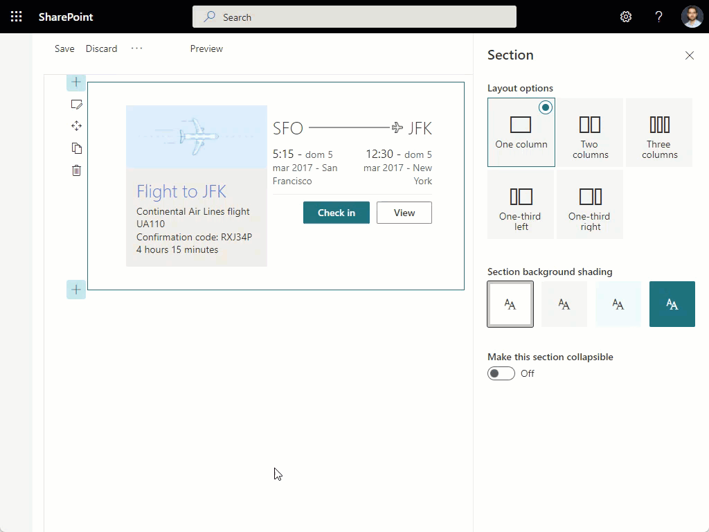
Here is an example of the control in action inside a Web Part:
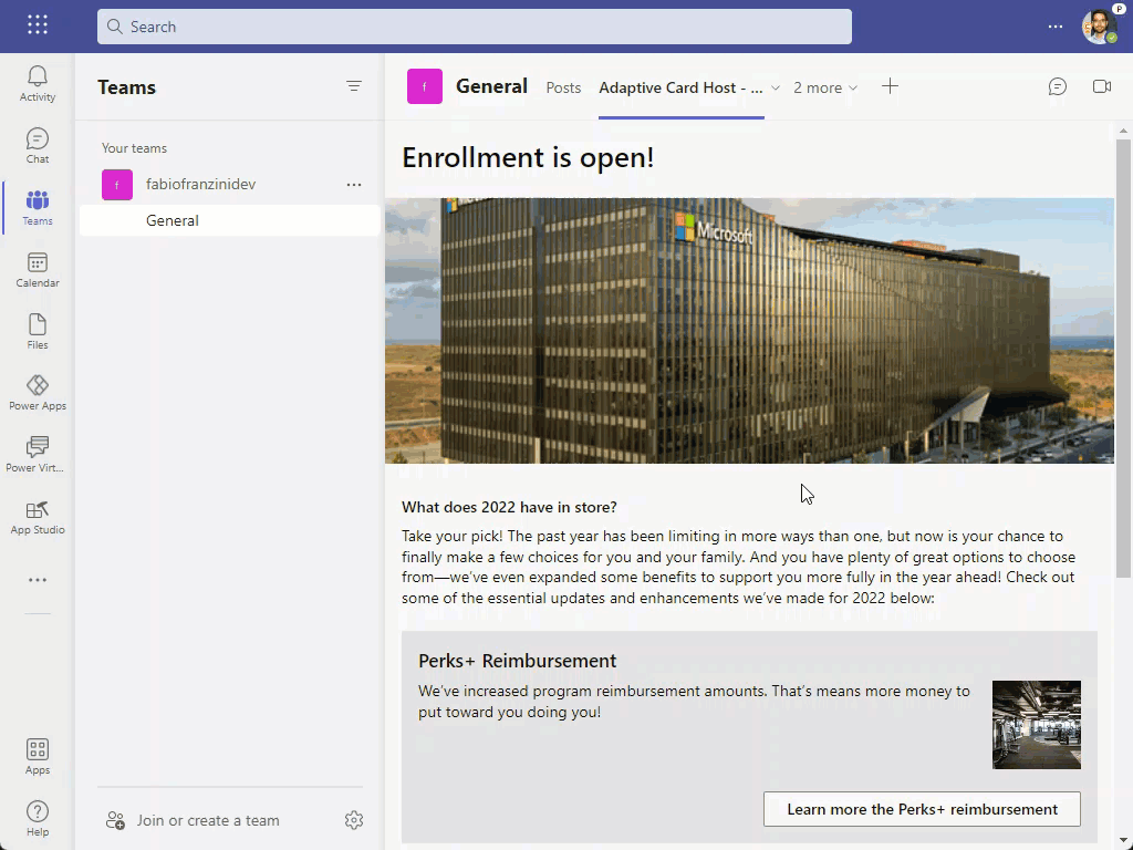
Here is an example of the previous Web Part (using different Card), hosted as a Tab in Microsoft Teams:
How to use this control in your solutions
- Check that you installed the
@pnp/spfx-controls-reactdependency. Check out the getting started page for more information about installing the dependency. - In your component file, import the
AdaptiveCardHostcontrol as follows:
import { AdaptiveCardHost, IAdaptiveCardHostActionResult, AdaptiveCardHostThemeType, Action, CardElement, CardObjectRegistry, HostCapabilities } from "@pnp/spfx-controls-react/lib/AdaptiveCardHost";
- Example on use the
AdaptiveCardHostcontrol with only required properties:
<AdaptiveCardHost
  card={card}
  onInvokeAction={(action) => alert(JSON.stringify(action))}
  onError={(error) => alert(error.message)}
  context={this.props.context}
/>
- Example on use the
AdaptiveCardHostcontrol with all properties:
<AdaptiveCardHost
  card={card}
  data={data}
  style={null}
  className={null}
  theme={this.props.theme}
  themeType={themeType}
  hostConfig={null}
  onInvokeAction={(action) => alert(JSON.stringify(action))}
  onError={(error) => alert(error.message)}
  onSetCustomElements={(registry: CardObjectRegistry<CardElement>) => {
    registry.register("CustomElementName", CustomElement);
  }}
  onSetCustomActions={(registry: CardObjectRegistry<Action>) => {
    registry.register("CustomActionName", CustomAction);
  }}
  onUpdateHostCapabilities={(hostCapabilities: HostCapabilities) => {
    hostCapabilities.setCustomProperty("CustomPropertyName", Date.now);
  }}
  context={this.props.context}
/>
- Example on use the
AdaptiveCardHostcontrol with SharePoint Theme:
<AdaptiveCardHost
  card={card}
  themeType={AdaptiveCardHostThemeType.SharePoint}
  onInvokeAction={(action) => alert(JSON.stringify(action))}
  onError={(error) => alert(error.message)}
  context={this.props.context}
/>
- Example on use the
AdaptiveCardHostcontrol with SharePoint Theme "Section Variation" ('this.props.theme' is the theme that come from the Web Part):
<AdaptiveCardHost
  card={card}
  theme={this.props.theme}
  themeType={AdaptiveCardHostThemeType.SharePoint}
  onInvokeAction={(action) => alert(JSON.stringify(action))}
  onError={(error) => alert(error.message)}
  context={this.props.context}
/>
- Example on use the
AdaptiveCardHostcontrol with Teams "Default" Theme:
<AdaptiveCardHost
  card={card}
  themeType={AdaptiveCardHostThemeType.Teams}
  onInvokeAction={(action) => alert(JSON.stringify(action))}
  onError={(error) => alert(error.message)}
  context={this.props.context}
/>
- Example on use the
AdaptiveCardHostcontrol with Teams "Dark" Theme:
<AdaptiveCardHost
  card={card}
  themeType={AdaptiveCardHostThemeType.TeamsDark}
  onInvokeAction={(action) => alert(JSON.stringify(action))}
  onError={(error) => alert(error.message)}
  context={this.props.context}
/>
- Example on use the
AdaptiveCardHostcontrol with Teams "High Contrast" Theme:
<AdaptiveCardHost
  card={card}
  themeType={AdaptiveCardHostThemeType.TeamsHighContrast}
  onInvokeAction={(action) => alert(JSON.stringify(action))}
  onError={(error) => alert(error.message)}
  context={this.props.context}
/>
Implementation
The AdaptiveCardHost control can be configured with the following properties:
| Property | Type | Required | Description |
|---|---|---|---|
| card | object | yes | Set Adaptive Card payload. |
| data | { "$root": object } | no | Set Data Source for template rendering. |
| style | React.CSSProperties | no | Set CSS Style. |
| className | string | no | Set CSS Class. |
| theme | IPartialTheme or ITheme | no | Set Fluent UI Theme. Used only if the "themeType" property is set to 'ThemeType.SharePoint'. If not set or set to null or not defined, the theme passed through context will be searched, or the default theme of the page will be loaded. However, the Theme object will be automatically injected into the data object, so that it can be used by the Adaptive Cards binding engine. |
| themeType | ThemeType | no | Select the Type of Theme you want to use. If it is not set or set to null or undefined, the 'ThemeType.SharePoint' value will be used and the "theme" property or the theme passed through the context or default page will be loaded. In other cases, the chosen Microsoft Teams theme will be applied. |
| hostConfig | object | no | Set custom HostConfig. |
| onInvokeAction | (action: IAdaptiveCardActionResult) => void | yes | Invoked every time an Action is performed. |
| onError | (error: Error) => void | yes | Invoked every time an exception occurs in the rendering phase. |
| onSetCustomElements | (registry: CardObjectRegistry<CardElement>) => void | no | Invoked to manage Elements to the current Adaptive Card instance. |
| onSetCustomActions | (registry: CardObjectRegistry<Action>) => void | no | Invoked to manage Actions to the current Adaptive Card instance. |
| onUpdateHostCapabilities | (hostCapabilities: HostCapabilities) => void | no | Invoked to manage the HostCapabilities object like add custom properties. |
| context | BaseComponentContext | no | Set the context from the SPFx component. If set, some context properties will be automatically injected into the data object, so they can be used by the Adaptive Cards binding engine. |
Interface IAdaptiveCardHostActionResult
| Property | Type | Required | Description |
|---|---|---|---|
| type | string | yes | Type of the Action. |
| title | string | no | Title of the Action. |
| url | string | no | Url of the Action. |
| data | object | no | Data of the Action. |
| verb | string | no | Verb of the Action. |
Enum AdaptiveCardHostThemeType
| Type | Description |
|---|---|
| SharePoint | Use the SharePoint current Theme or Theme Variation |
| Teams | Use the Fluent UI Teams default theme |
| TeamsDark | Use the Fluent UI Teams dark theme |
| TeamsHighContrast | Use the Fluent UI Teams high contrast theme |