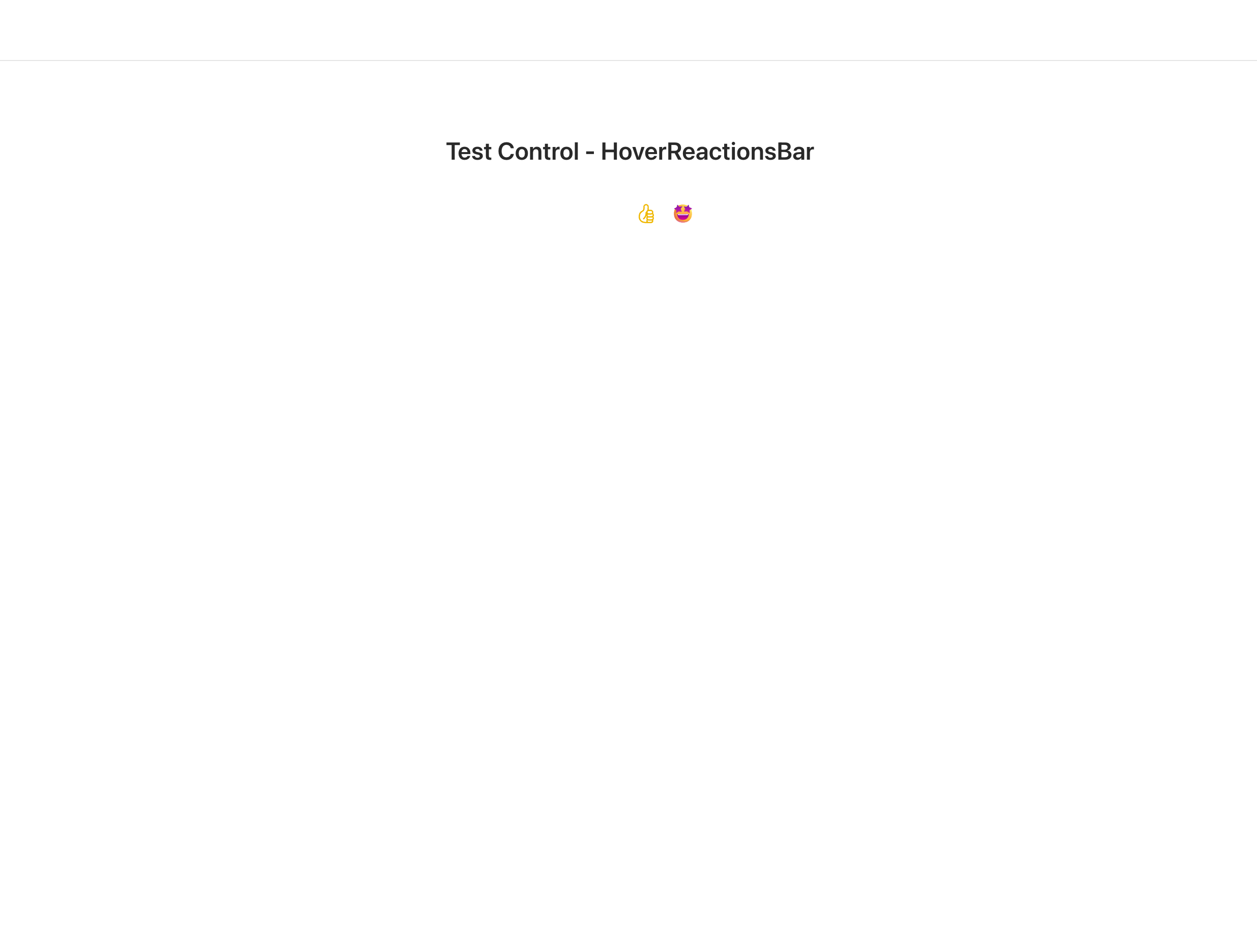
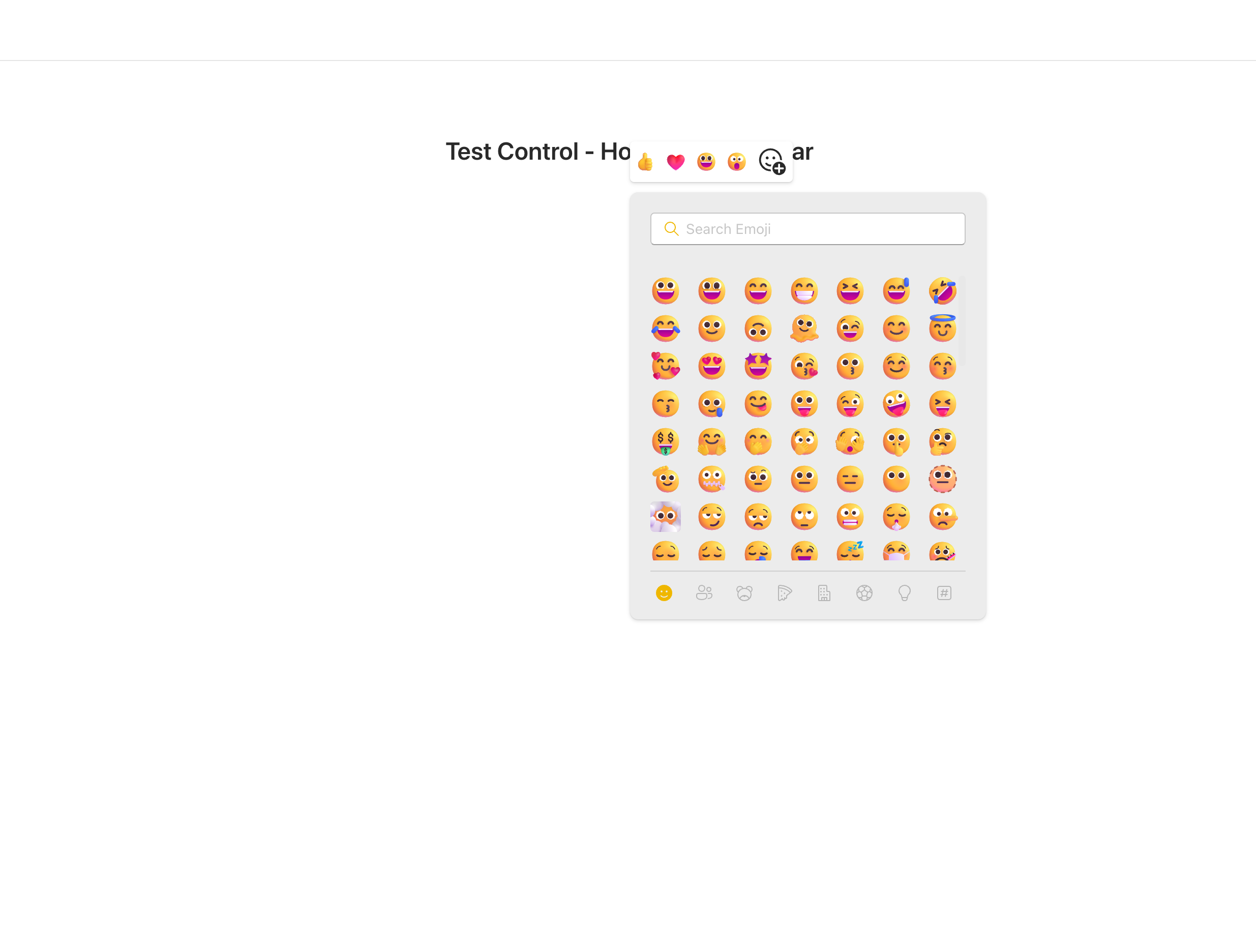
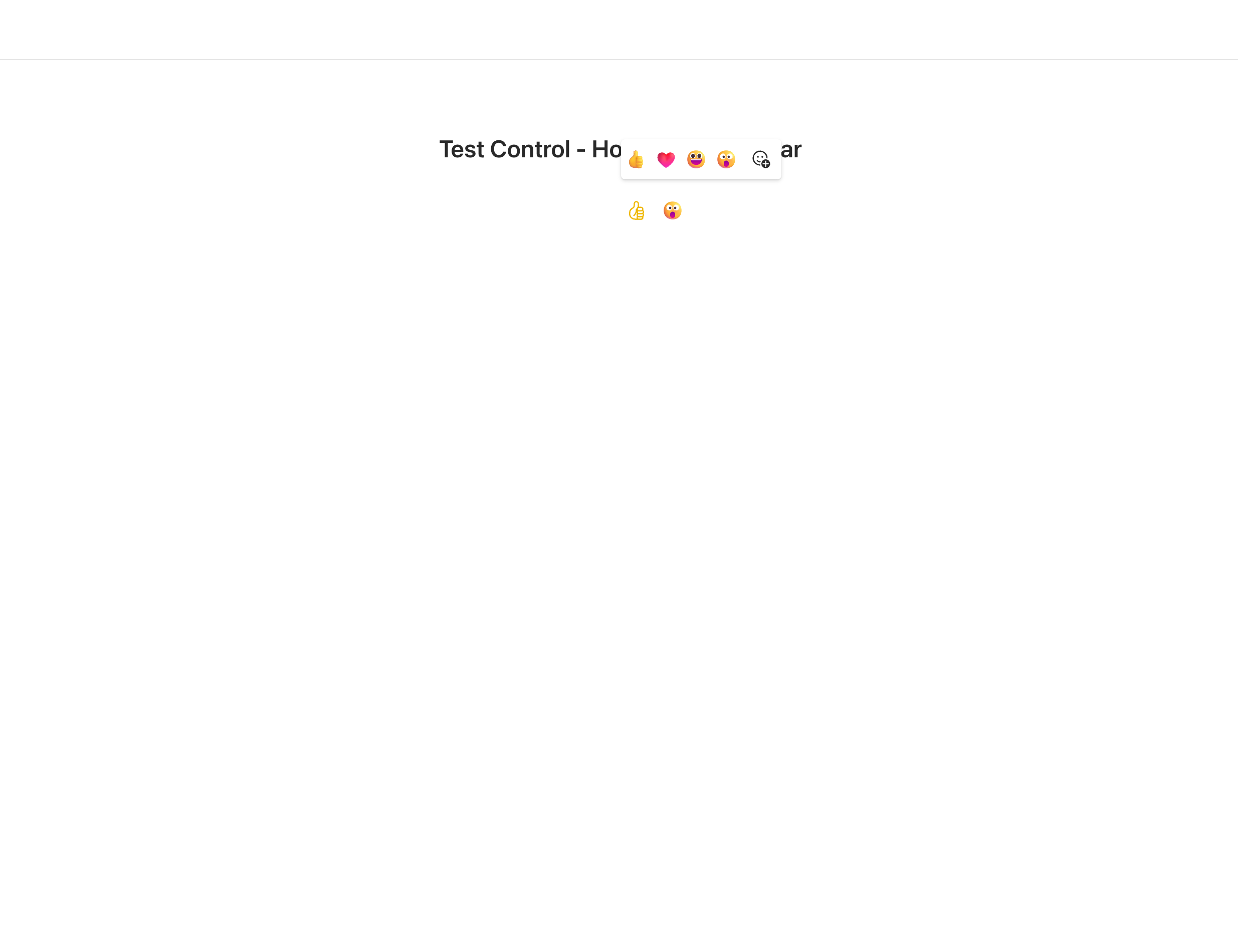
HoverReactionsBar
This control allows you to select an emoji from emoji bar or select from picker.
Here is an example of the control in action:
How to use this control in your solutions
- Check that you installed the
@pnp/spfx-controls-reactdependency. Check out the getting started page for more information about installing the dependency. - Import the following modules to your component:
import { HoverReactionsBar } from '@pnp/spfx-controls-react/lib/HoverReactionsBar';
- Use the
HoverReactionsBarcontrol in your code as follows:
<HoverReactionsBar
  isOpen={isOpenHoverReactionBar}
  onSelect={onSelectEmoji}
  onDismiss={(): void => {
    setIsOpenHoverReactionBar(false);
  }}
  target={divRefAddReaction.current as HTMLDivElement}
/>
- With the
onSelectproperty you can get the selected emoji:
const onSelectEmoji = React.useCallback(async (emoji: string, emojiInfo: IEmojiInfo) => {
  console.log('emoji', emoji);
  console.log('emojiInfo object',emojiInfo);
  setIsOpenHoverReactionBar(false);
}, []);

onSelect: (emoji: string | undefined, emojiInfo?: IEmojiInfo) => void;
isOpen: boolean;
onDismiss: () => void;
top4Reactions?: string[];
target: HTMLDivElement;
themeV8?: Theme;
Implementation
The HoverReactionsBar control can be configured with the following properties:
| Property | Type | Required | Description |
|---|---|---|---|
| isOpen | boolean | yes | show hoverReactionsBar |
| onSelected | onSelect: (emoji: string, emojiInfo?: IEmojiInfo) => void; | yes | selected Emoji |
| top4Reactions | string[] | no | name of emojis to show on the bar |
| target | HTMLDivElement | yes | container of controls who fire the HoverReactionsBar |
| onDismiss | onDismiss: () => void; | yes | function to call to dismiss HoverReactionsBar |
| themeV8 | Theme | No | Set Fluent UI Theme |