Dashboard control
Dashboard component for Microsoft Teams.
Note
As this component is based on @fluentui/react-northstar the main usage scenario is Microsoft Teams projects. You can still use it in non-Teams related projects as well.
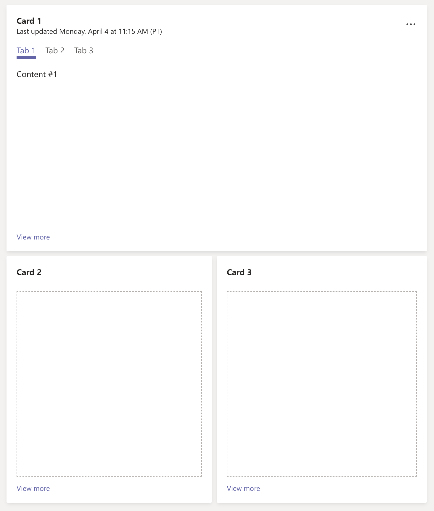
Here is an example of the control in action:
How to use this control in your solutions
- Check that you installed the
@pnp/spfx-controls-reactdependency. Check out the getting started page for more information about installing the dependency. - Import the following modules to your component:
import { WidgetSize, Dashboard } from '@pnp/spfx-controls-react/lib/Dashboard';
- Use the
Dashboardcontrol in your code as follows:
const linkExample = { href: "#" };
const customizedLinkExample = {
      href: "#",
      title: "This is a customized link!",
      color: "red",
      target: "_top"
    };
const calloutItemsExample = [
  {
    id: "action_1",
    title: "Info",
    icon: <Icon iconName={'Edit'} />,
  },
  { id: "action_2", title: "Popup", icon: <Icon iconName={'Add'} /> },
];
// ...
<Dashboard
  widgets={[{
    title: "Card 1",
    desc: "Last updated Monday, April 4 at 11:15 AM (PT)",
    widgetActionGroup: calloutItemsExample,
    size: WidgetSize.Triple,
    body: [
      {
        id: "t1",
        title: "Tab 1",
        content: (
          <Text>
            Content #1
          </Text>
        ),
      },
      {
        id: "t2",
        title: "Tab 2",
        content: (
          <Text>
            Content #2
          </Text>
        ),
      },
      {
        id: "t3",
        title: "Tab 3",
        content: (
          <Text>
            Content #3
          </Text>
        ),
      },
    ],
    link: linkExample,
  },
  {
    title: "Card 2",
    size: WidgetSize.Single,
    link: customizedLinkExample,
  },
  {
    title: "Card 3",
    size: WidgetSize.Double,
    link: linkExample,
  }]} />
Implementation
The Dashboard component can be configured with the following properties:
| Property | Type | Required | Description |
|---|---|---|---|
| widgets | IWidget[] | yes | Widgets collection. |
| allowHidingWidget | boolean | no | Specifies if widgets can be hidden from the dashboard. |
| onWidgetHiding | (widget: IWidget) => void | no | Handler of widget hiding event. |
| toolbarProps | IToolbarProps | no | Dashboard toolbar props. See Toolbar. |
| WidgetContentWrapper | React.ComponentType\ |
no | Optional component which wraps every Widget component. Useful for a custom error handling or styling. |
Interface IWidget
Provides settings of Dashboard's widget
| Property | Type | Required | Description |
|---|---|---|---|
| size | WidgetSize | yes | Size. |
| title | string | yes | Title. |
| desc | string | no | Description. |
| widgetActionGroup | IWidgetActionKey[] | no | Actions. |
| controlOptions | IWidgetControlOptions | no | Component rendering options. |
| body | IWidgetBodyContent[] | no | Widget's content (children) rendered as tabs. |
| link | IWidgetLink | no | Widget's link rendered at the bottom part of the widget. |
| rowSpan | number | no | Number of rows the widget should span. If specified, it will override any vertical value set from the size property. |
Interface IWidgetActionKey
Provides Dashboard Widget Action properties
| Property | Type | Required | Description |
|---|---|---|---|
| id | string | yes | Action id. |
| icon | JSX.Element | no | Action icon. |
| title | string | yes | Action title. |
| onClick | () => void | no | Action handler. |
Interface IWidgetControlOptions
Provides Widget component options
| Property | Type | Required | Description |
|---|---|---|---|
| isHidden | boolean | no | Specifies if current widget is hidden. |
Interface IWidgetBodyContent
Provides Widget content (tab) properties
| Property | Type | Required | Description |
|---|---|---|---|
| id | string | yes | Content (tab) id. |
| title | string | yes | Content (tab) title. |
| content | React.ReactNode | yes | Tab content. |
Interface IWidgetLink
Provides Widget link properties
| Property | Type | Required | Description |
|---|---|---|---|
| href | string | yes | Link to be opened. |
| title | string | no | The text to display for the link, if not provided, the default text will be used. |
| color | string | no | The color of the link, if not provided, the "default" color will be used. The available colors can be found on the official Fluent UI documentation of the Text control. |
| target | string | no | The target property value for the generated anchor tag, if not provided, the default target will be _blank. |
Enum WidgetSize
Provides size of the widget
| Value | Description |
|---|---|
| Single | Single-sized grid item. |
| Double | Double-width grid item. |
| Triple | Triple width grid item. |
| Quadruple | Quadruple width grid item. |
| Box | Double-width, double-height grid item. |